


This work by New American History is licensed under a Attribution-NonCommercial-ShareAlike 4.0 (CC BY-NC-SA 4.0) International License. Permissions beyond the scope of this license may be available at newamericanhistory.org.
Electing the House of Representatives
(1840-2016)
Read for Understanding
Congress, especially the House of Representatives, has often been portrayed as the more representative branch of government. It more directly and frequently reflects the changing demographics and changing will of American voters through its biennial elections. The fine-grained geography of Congressional districts, especially in the House, also allows us to see the waxing and waning of democratic ideals within the long arc of expanding voting rights over time by emphasizing the building block of representative democracy--elections.
Key Vocabulary
Apportionment - The process of allocating House seats to match the changing U.S. population.
Cartogram - A map that combines statistical information with geographic location.
Geolocation - The identification or estimation of the real-world geographic location of an object, such as a radar source, mobile phone, or Internet-connected computer terminal.
Gerrymandering - The term for a heavily partisan division of districts to favor one party over another.
Redistricting - The state-by-state process of deciding how to divide up the population for geographic districts.
Engage:
How do maps help us understand data such as population and voting patterns?
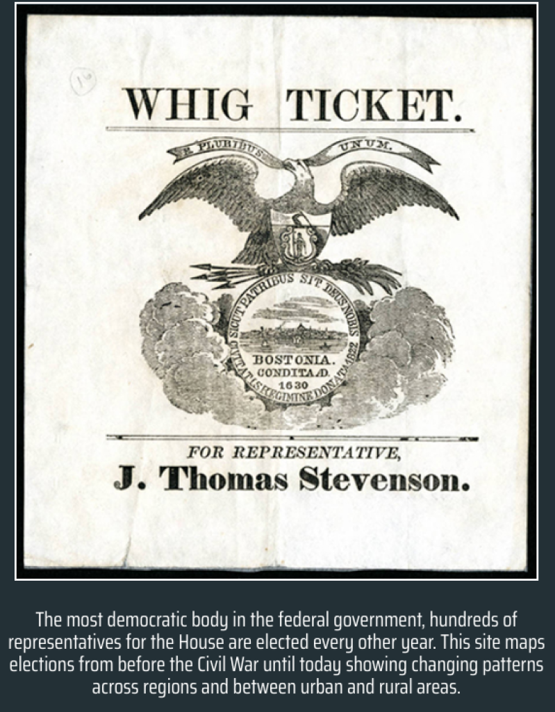
Click on the American Panorama Map URL ('Electing the House of Representatives') above.
Read the introduction below the Whig Ticket political flyer image, and click NEXT
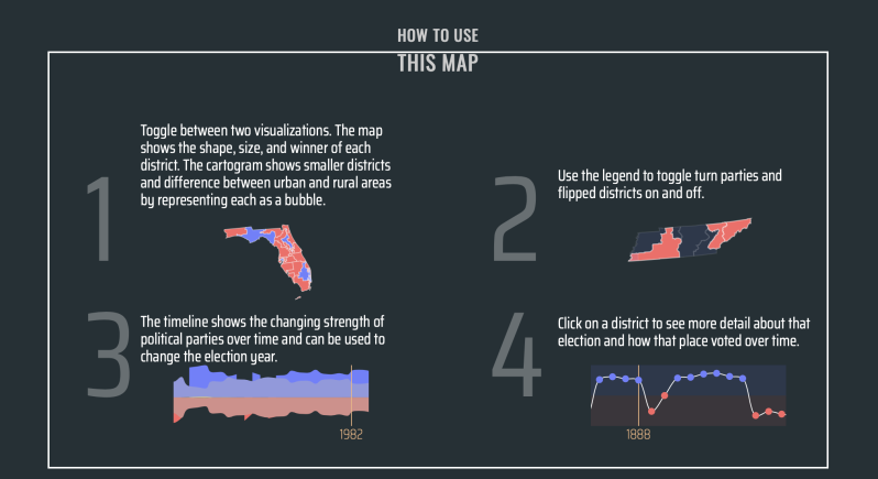
Read “How to Use This Map” and click ENTER
Take 10 minutes to explore the map and its tools. What do you notice?
Turn and talk to a partner. Share:
- 3 things you already knew about this topic
- 2 new vocabulary words you learned
- 1 question you have about the map so far
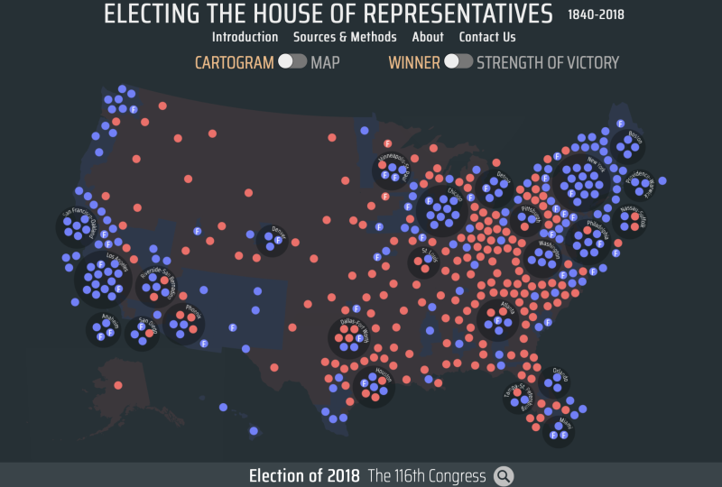
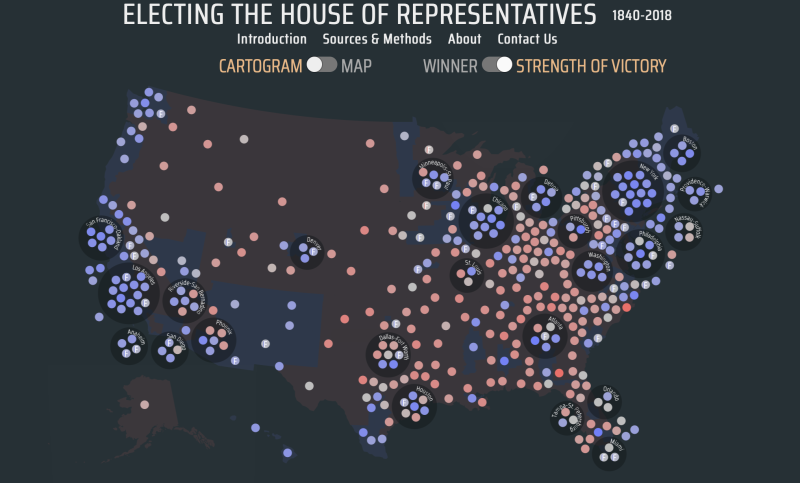
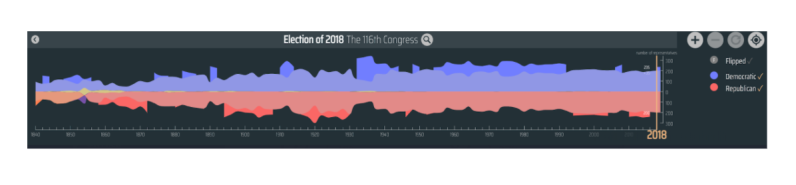
Locate this graphic at the top of the map:

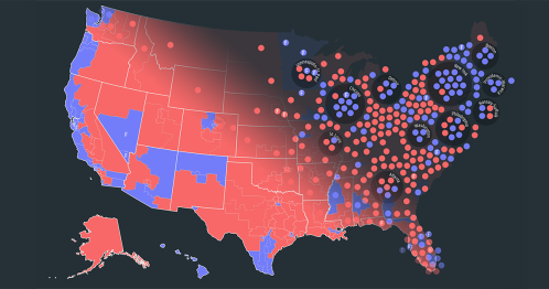
Toggle (switch back and forth) between the two visualizations: the cartogram and the map. The cartogram shows smaller districts and the difference between urban and rural areas by representing each as a bubble.
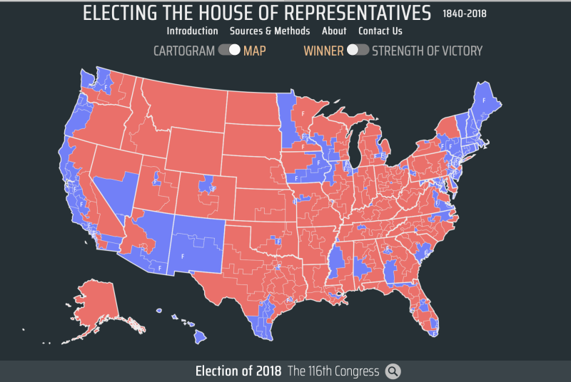
Toggle again between the two visualizations, selecting the map. The map shows the shape, size, and winner of each district.
- What is the significance of the use of color on the map and cartogram?
- Use the cartogram and the map to describe in a sentence how the colors are used to relate information about election patterns in the U.S. House of Representatives.
Now let’s focus on the map:
- What do you notice about the distribution of red v. blue voting districts on this map?
- Where do you see the majority of voting districts represented in blue?
Turn and talk to a partner about these questions. Discuss what you both know about the size of the population in the districts represented in red v. blue on the map. Now take a look at your own state.
- Is your state all one color or are there parts of your state shaded in both red and blue?
Click on your own state.
- What do you notice when you click inside your state on the map?
Double click and zoom in on your state, clicking in different parts of the state.
- Does the map change when you click in different locations on the map?
Focus on the part of the map which shows your approximate location.
- What do you notice about how the colors are used on the map to share information about past voting patterns?
Your teacher may ask you to record your answers on an exit ticket.
Explore:
How does the House of Representatives reflect the changing population patterns of the United States?
If we examine the map in closer detail, we can double click on each individual district within a state.
- Notice that when you double click on a district inside your state, a map key appears below in the far left side of the screen.
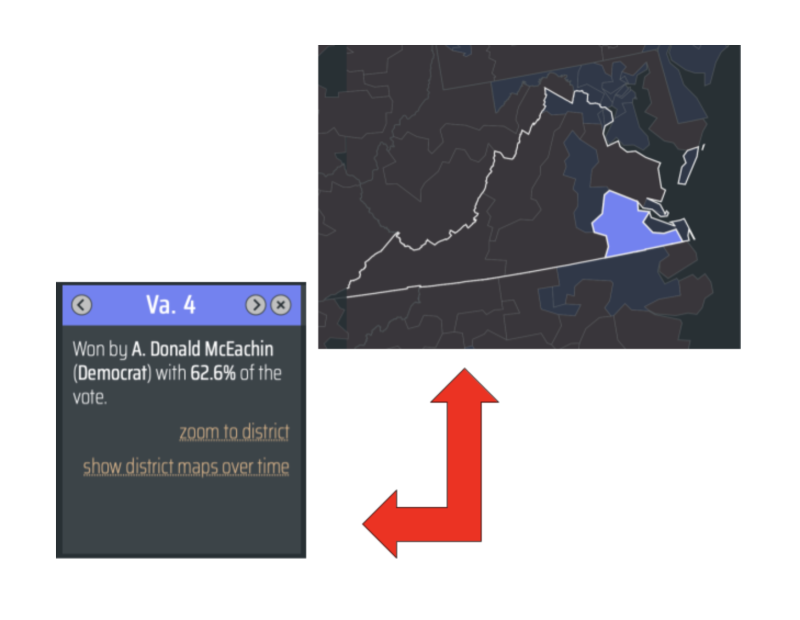
- What new information is shared in this section of the key?
- What happens when you click on different districts in your state? Turn and talk to a partner about your thoughts. You may want to use the “zoom to district” link in the key. If your state is completely shaded by only one color, you may want to select a state with some areas shaded both red and blue to explore more features on the map.
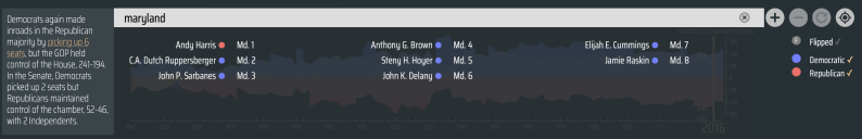
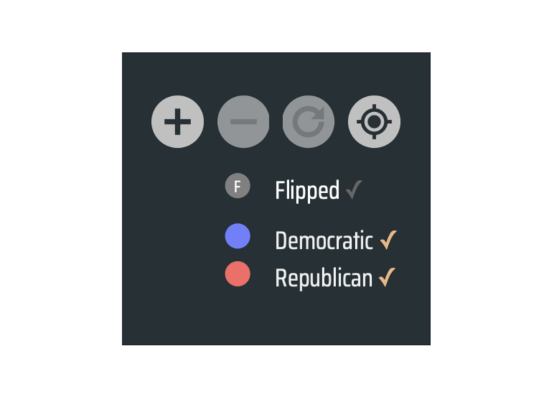
This graphic has some additional tools you can use to search and access more information. Try typing in the name of your state in the gray search bar. Use the +/- icons to zoom in and out on the map.
Use the circular back arrow or “undo” icon to return back to the map.

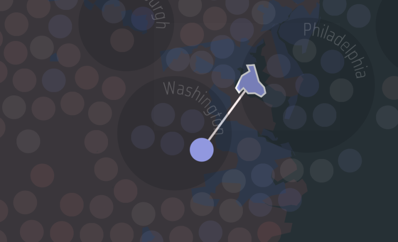
Use the compass icon to find your current location (you may have to “allow” location settings to be accessed on your device to use this feature).
- What appears on the screen when you activate this feature?
- Why do you think the cartographer who created this map included this tool?
With a partner, sit side by side and select 2 different states which border your current location.
- What do you notice? Take a few minutes to discuss how these states voted compared to your own state.
- What similarities or differences do you notice?
- Turn and talk to your partner about these differences.
The map key above also explains the colors used on the map, including blue to represent districts which voted “Democratic,” red to represent districts which voted Republican, and the letter “F” to denote districts which “flipped” or voted for a different political party than in the previous election.
Click on the word “Flipped” in the map key to the right of the search box.
- What changes to the map do you notice?
- What surprised you about these changes to the map?
- Were there any districts in your state that “flipped?”
- Where in the U.S. do you see the most “flipped” districts?
- Where are the least amount of changes on the map?
- What factors might explain these changes?
Your teacher may ask you to record your answers on an exit ticket.
Explain:
How can we use a cartogram of election data from the U.S. House of Representatives to analyze the changing demographics and changing will of American voters?
Refresh or reload your map to return to the original screen below. Be sure the toggle is set to “Cartogram” instead of “Map.”
Remember, the map we viewed earlier showed the shape, size, and winner of each district. The cartogram above shows smaller districts and the difference between urban and rural areas by representing each as a bubble.
Take 10-15 minutes to review the tools we used in the previous lesson, using the cartogram instead of the map.
- What patterns do you see on the cartogram?
- How do the patterns on the cartogram compare to those we saw on the map earlier?
- When you use the + icon to zoom in on the map, what do you notice?
- What changes happen to the cartogram when you search by state?
- How does the map change when you use the compass icon to “geolocate” or find your exact location on the map?
Turn and talk to a partner about the changes you noticed on the map.
- What surprised you the most about the data represented in this way?
Zoom back out to the map and reload your browser. Navigate back to the cartogram as shown above.
- Do you notice any clusters or grouping of dots on the cartogram?
Zoom in using the + tool and describe to your partner what you see near these clusters. Discuss what you already know about these locations.
Click on one of the clusters of dots that is closest to your current location. Click on a dot inside the cluster and notice who the cartogram changes.
- What information do the cartogram and the key give you about this district?
- If you click on another dot in the cluster, what happens to the cartogram?
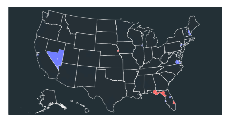
Refresh the map and close out the key on the left side of the search bar by selecting the “x, then on the toolbar on the right of the search bar, click on the word “Flipped.”
- Which party “flipped” the most districts in the 2016 election? The 2018?
- What patterns do you see when you look at the districts that were “flipped?” Compare a few different years
- What might explain these changes in the way people voted in these districts?
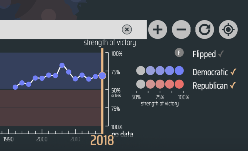
Refresh your browser again, and navigate back to the cartogram. At the top of the cartogram, turn the toggle from “Winner” to “Strength of Victory.”
- What changes do you see to the colors on the cartogram?
Notice how the key to the right of the search box changes to help describe the “strength of victory” in each voting district.
Use the geolocate tool to compare the strength of victory in your district. (You may need to zoom in using the + icon to get a better view.)
Turn and talk to a partner, taking turns explaining to each other how “flipping” a district” and “strength of victory” are explained using visualization tools on the cartogram, including colors, clustering and geolocating.
Your teacher may ask you to record your answers on an exit ticket.
Elaborate:
Do demographic changes in an area impact the way different Congressional districts have voted over time?
For this lesson, we will work in pairs, with one partner displaying the cartogram and the other partner displaying the map. Be sure to refresh or reload your browser, and use the toggle so each partner has one of the following views on their map:
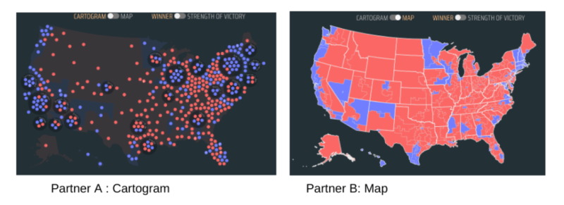
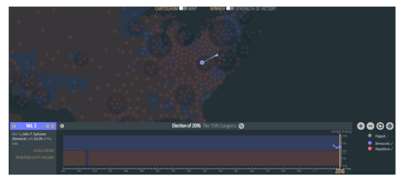
Take 15 minutes to work in pairs to explore the timeline located below the map/cartogram. The timeline shows the changing strength of political parties over time and can be used to change the election year.
This graphic has a slider tool. The thicker orange line can slide between decades to show changes over time. Take a few minutes to move the slider and observe how the data changes.
- How do the map and cartogram change as you slide the tool over each decade of time?
- What patterns do you notice as you slide the tool between each decade?
- Do the colors and numbers of political parties represented on the graphics stay the same or do they change?
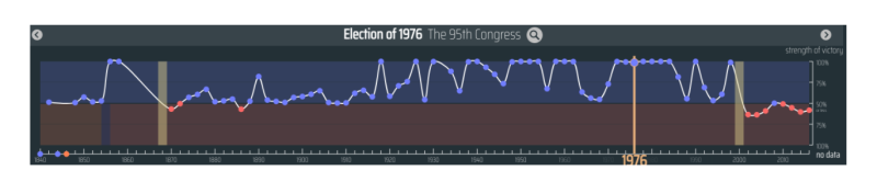
Notice as you slide the tool over the years, additional information is provided in the box to the left of the timeline.
- How have major historical events such as the Civil War, Cuban Missile Crisis or the attacks on the U.S on 9/11 in 2001 shaped the voting patterns over time?
Select a location or use the compass tool to geolocate your current location on the map or cartogram. What happens to the timeline when you select a specific place?
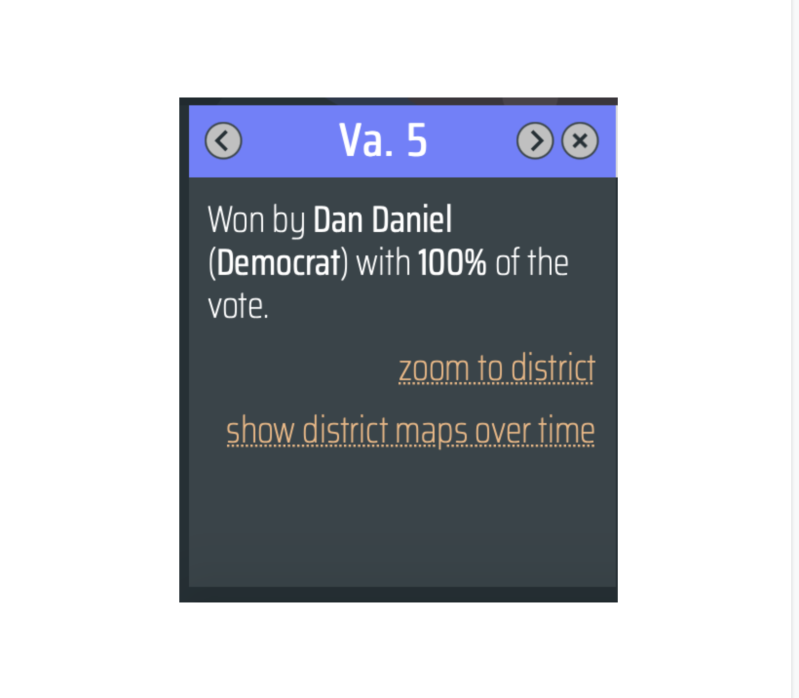
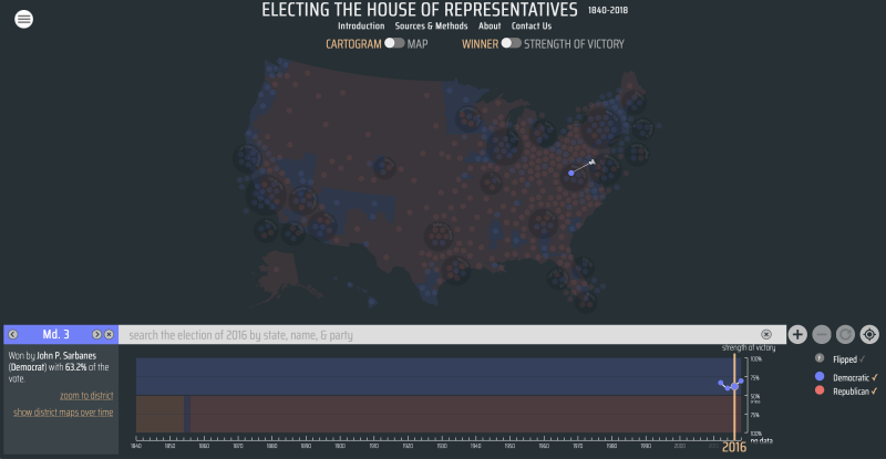
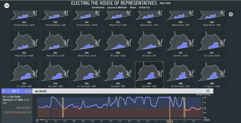
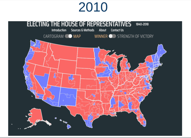
Now look at the box to the left of the timeline/graph and click on “show district maps over time.”
- What happens to the map?
Scroll through each decade of the individual maps which visualize the district data over time.
- Have the size and shape of the voting district changed over time?
- Did the winning party stay consistent or were there periods when it “flipped?”
- What might explain these changes?
- What is the connection between population density and the size of congressional districts?
- Did the size and shape of the district change over time or stay the same?
- What might explain these changes, if there were some?
Refresh your browser again and work independently, viewing the map and timeline.
- If you move the slider tool to the far left and slowly move it along each year, what do you notice about the names and number of political parties in each election year?
- What do you notice about the shape of the map?
- How does the map visualize the size of the United States in each historical time period?
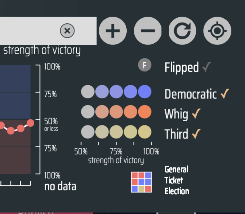
Move the slider to the year 1840. In the far right corner underneath the tools, move your cursor over the “General Ticket Election” icon and read the explanation in the box which should pop up on your screen.
General ticket voting is no longer used in the United States except on very rare occasions. You can learn more about general ticket voting here.
- Why do you think general ticket voting is no longer used very much in the United States?
As you continue to explore the map, go back and review the key vocabulary terms and explanations of each term in the Introduction.
This video gives a quick overview of the term "Gerrymandering" and explains how it works.
Watch this with your class before we continue the lesson, or view this slideshow on your own from the League of Women Voters.
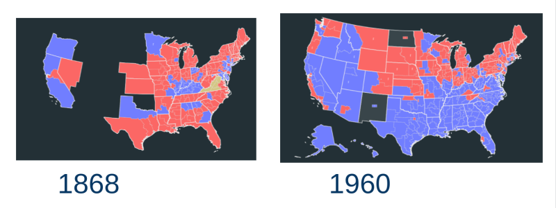
Now let’s focus on these 2 years: 1868 and 1960. Refresh your browser or reload your map and navigate to each of these years using the slider tool. (You may also choose to work with a partner, each displaying a different year on your device's screen.)
- What changes do you notice on the map comparing the data over this period of time?
- How has the size of the United States changed between 1868-1960? Explain these changes.
- How has the population in the United States changed from 1868-1960?
- How have the changes in population impacted representation in the U.S. House of Representatives overall? In your state? In your district? Use the geolocator tool to help you.
Think about what you have learned about Gerrymandering and redistricting. Using the slider tool, can you locate some examples of this on the map? Share these with a partner. Compare and contrast these examples with a state in another region of the U.S. if time permits.
The United States Census Bureau collected population data again in 2020. States used this data to redraw their Congressional maps. Some maps were accepted while others were challenged, leading to court cases and in some cases, judges requiring maps to be redrawn. Some of these cases are still pending. For the most current maps of your state, visit:
- What changes do you notice in the way voting districts were redrawn?
- What factors might explain these changes in redistricting?
- Did your state or district “flip” or stay the same? Explain your answer.
Your teacher may ask you to record your answers on an exit ticket.
Extend:
How will changes in population and social media influence future voting patterns?
View this TEDx Talk on Redistricting featuring Professa Rebecca Theobald from the GeoCivics project.
This annual report analyzes Congressional Tweets.
- What topics did Congress tweet about the most in the past year?
- What topics included in the report did you find most surprising?
- What topics do you predict the next report will include about Congressional Tweets?
- How do you think social media influences or impacts voters during an election cycle?
Your teacher may ask you to record your answers on an exit ticket.
Citations:
League of Women Voters of the Charleston Area, “Confused About Redistricting and Gerrymandering.” Newsbound, http://lwvcharleston.org/RedistrictingReform.html.
Robert K. Nelson, LaDale Winling, and Justin Madron, "Electing the House of Representatives," in American Panorama, ed. Nelson and Edward L. Ayers, https://dsl.richmond.edu/panorama/congress.
Smart, Charlie. “The Language of Congress.” The Language of Congress, The Pudding, 2019, https://congress.pudding.cool/
Taylor, Daron. “Gerrymandering, explained.” The Washington Post, April 21, 2016, https://www.washingtonpost.com/video/business/wonkblog/gerrymandering-explained/2016/04/21/e447f5c2-07fe-11e6-bfed-ef65dff5970d_video.html.