
This work by New American History is licensed under a Attribution-NonCommercial-ShareAlike 4.0 (CC BY-NC-SA 4.0) International License. Permissions beyond the scope of this license may be available at newamericanhistory.org.
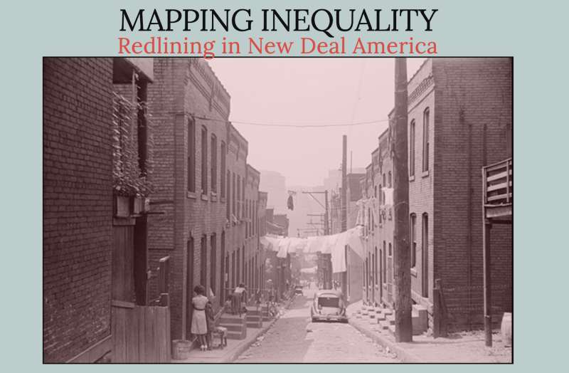
Mapping Inequality v3.0
Redlining in New Deal America
Read for Understanding
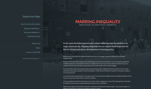
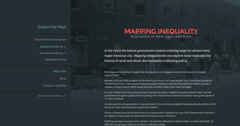
Mapping Inequality introduces the viewer to the records of the Home Owners' Loan Corporation (HOLC) on an unprecedented scale. Here you can browse more than 150 interactive maps and thousands of "area descriptions." These materials afford an extraordinary view of the geography of wealth and racial inequality in Depression-era American cities and insights into discriminatory policies and practices that so profoundly shaped cities that we feel their legacy to this day. In this updated version, additional cities have been added to expand our understanding of segregated housing policies at the state and local levels.
Key Vocabulary
Demographics - The study of a population based on factors such as age, race, gender, income level, education level, and other statistical data.
New Deal - a series of programs, public work projects, financial reforms, and regulations enacted by President Franklin D. Roosevelt in the United States between 1933 and 1938.
Query - A question posed to check for accuracy; with geospatial technology, a question using the map and data stored with the map.
Redlining - The practice of denying a creditworthy applicant a loan for housing in a certain neighborhood even though the applicant may otherwise be eligible for the loan. The term refers to the presumed practice of mortgage lenders of drawing red lines around portions of a map to indicate areas or neighborhoods in which they do not want to make loans.
Restrictive covenants - An agreement in a deed to real estate (land/property) that restricts future use of the property, often enforceable against future owners. Restrictive covenants based on race were declared unconstitutional in 1949.
Segregationist - A person who supports the policy of enforced separation of different racial groups.
Structural racism - Laws and public policies that create a disadvantage for people of color, including unfair employment, educational, housing, banking, and lending practices.
View this map on American Panorama.
Engage:
How can maps help us visualize the segregationist housing policies of New Deal America?
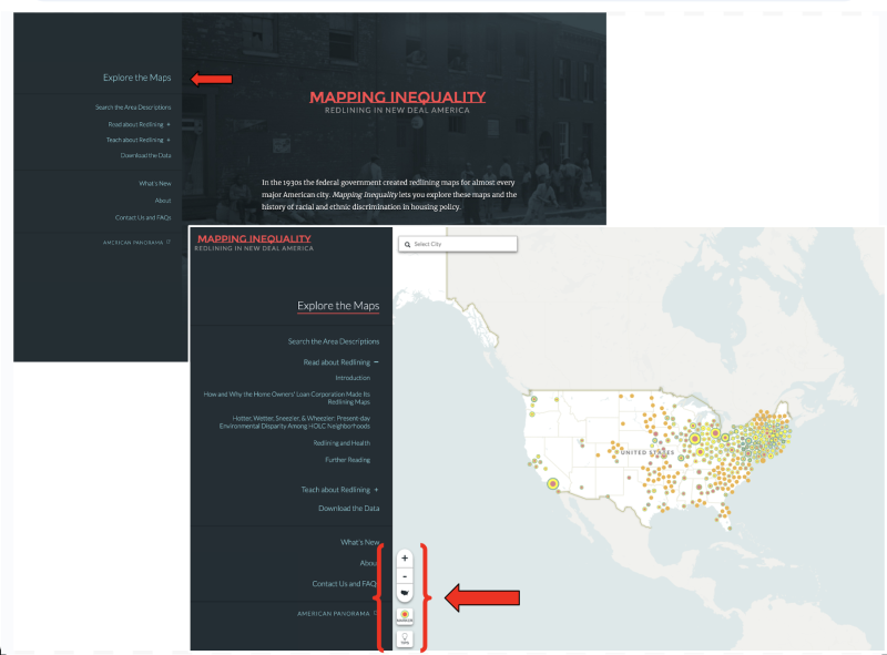
- Click on Explore the Maps in the menu on the left side of the screen.
- Examine the Tips section by selecting the lightbulb icon in the lower left corner.
- Take 10-15 minutes to explore the map and its tools. What do you notice?

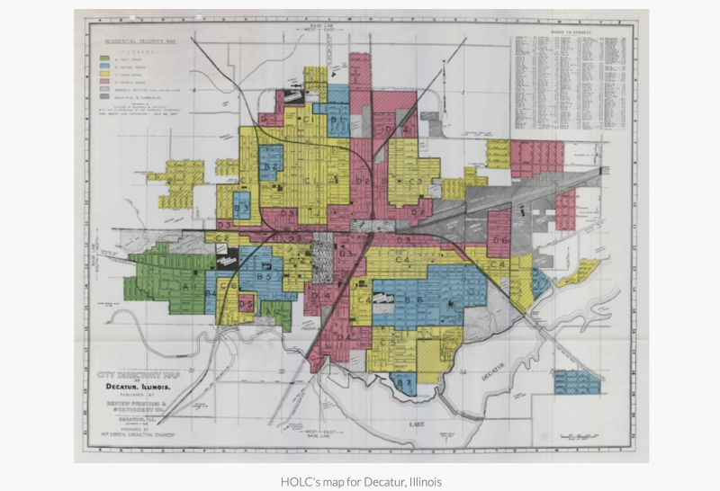
Click on Read About Redlining and read the Introduction using the link located on the left side of the map. Take turns reading each paragraph aloud with a partner, stopping to allow the listener to paraphrase what was just read or ask clarifying questions. Alternate between the reader and listener roles. Zoom in and study the primary source HOLC map pictured in the text for Decatur, IL.
Share:
3 things you found surprising or interesting about this topic
2 new vocabulary words you learned
1 question you have about the maps so far.
Repeat the same paired reading process by continuing to read The Reach of Redlining Across Space and The Reach of Redlining Across Time. Alternate as both reader and listener with your partner. Discuss how the HOLC maps and their ratings differed between the HOLC City Survey maps, the FHA maps, and the HOLC state-created non-City Survey maps.
Return to the maps by selecting Explore the Maps again from the menu on the left side of the screen. Familiarize yourself with the basic tools on the map. Remember, the lightbulb icon will take you to the Tips section for help navigating the map. Notice the +/- buttons in the bottom left corner which can be used to zoom in and out on the map. Try using these to change your view.
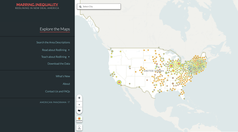
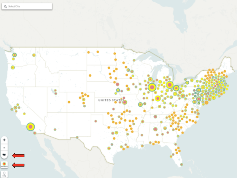
Locate the US map icon below the +/- buttons. What happens on the map when you click this icon? Use this icon to return to the full map view as we continue to explore the map.
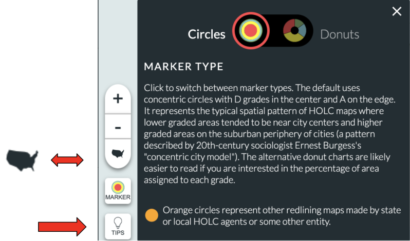
The Marker icons, located in the bottom left corner of the map, use color-coded circles or donut charts to visually represent data.
Based on the Tips section you read, how does this help the reader understand the different marker types used to rate the HOLC rating system?
- What type of marker is used to represent the redlining maps made by state or local HOLC agents or some other entity?
- How do these differ from the HOLC markers (circles/donuts)?
- What new information is revealed when you toggle between these different views?
- What information is easier to see with the Circle marker? With the Donut marker?
- Does each view change the patterns you see on the map?
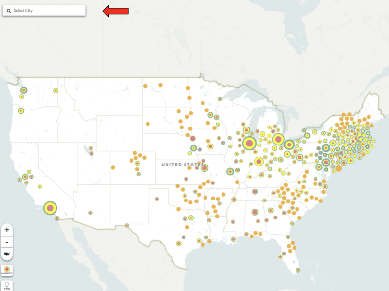
Locate the Select City box in the top left corner of the map. Type in the name of your city (or the closest city to your school or location) in the box and click enter to run a query (a geographic question using the map and data stored with the map.)
- Did your city show up on the map?
- If not, what are some reasons why you think it was not included?
Now try typing the name of your state in the same box.
- How many cities (if any) in your state are listed in the results?
- What states do not have any cities with a HOLC rating?
- Why do you think these states were not evaluated by HOLC during this time?
- What states are missing from the map? Why do you think they are not included?
Select another city and click on its name, then spend a few minutes exploring the map. Use the +/- buttons or the US map icon button to zoom out until you can see the entire United States on the map.
- What do you notice about the majority of cities included on the map?
- Where are there few or no cities represented on the map?
Use the US map icon to navigate back to the full map.
- What do you notice about the placement of the larger circular markers on the map?
- How do the colors in the larger markers correspond to the HOLC rating data you saw on the HOLC maps you explored?
- How do they compare to the maps of the cities you explored for your state/city (if any)?
- What other patterns do you notice?
- For what purpose do you think the mapmaker (cartographer) selected these tools?
Your teacher may ask you to record your answers on an exit ticket.
Explore:
How did redlining contribute to decades of racial segregation in America?
Structural racism refers to laws and public policies in the New Deal era that created a disadvantage for people of color, including unfair employment, housing, banking, and lending practices such as the federal mortgage policy of redlining that denied mortgages to blacks and other minorities. H
Redlining resulted in racial segregation and neighborhoods with declining property values. Redlined neighborhoods had a smaller tax base which affected school funding, access to health care, and the ability to generate wealth. These policies over time continue to be barriers to success for many people of color.
To fully understand the long-term impact, we need to take a closer look.
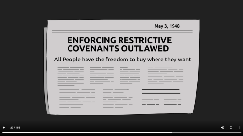
View this video from our friends at Untold History about the landmark Supreme Court case, Shelley v. Kraemer, which challenged the practice of racially restrictive covenants and redlining. You will learn more about J.D. and Ethel Shelley and their fight against restrictive housing covenants. Unable to purchase the house of their choice because of an agreement among homeowners to not sell to people of color, the Shelleys took their case to the Supreme Court. Their actions changed accessibility to housing for millions of Americans.
Continue to explore the map to get a better understanding of how redlining and racially restrictive covenants denied homeownership to many Americans in the New Deal era.

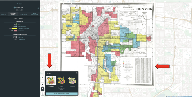
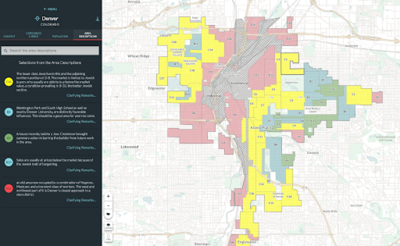
Select a different city to explore, either by typing the name in the search box or double-clicking on a city on the map. (We selected Denver, Colorado.) Notice how the map has now changed. Take 5-10 minutes to explore the new map you selected and its corresponding data on your own. Some of the tools are the same as the previous tools we have used with earlier maps, and some may be new, depending on the city you chose to explore.
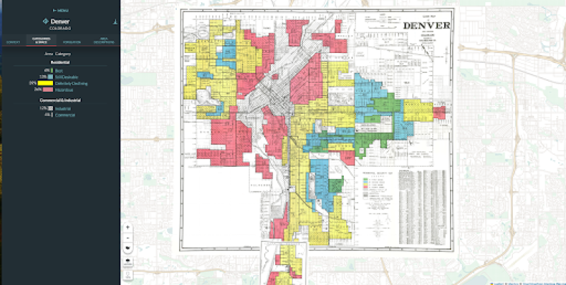
What city and state are on your map? What information is displayed to the left of the map? Take a few minutes to examine this information. Hover over each “Area Category.” What do you notice about the map as you hover over each colored bar? Read each description on the map key, and notice where each of these places is located on the map. As you read and observe, look for patterns.
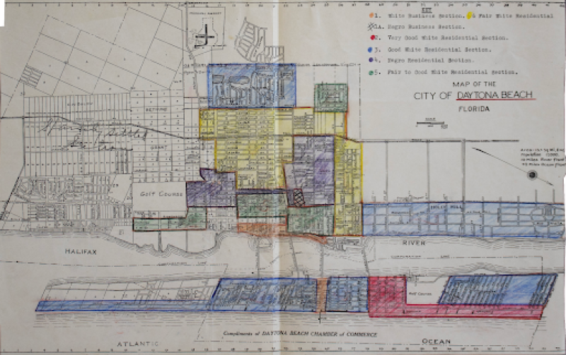
Now zoom in on the image of the original map on the right side of your screen, and locate the map key or legend. The placement of these will vary depending on the city you selected. (In some cases, it may be handwritten in the margins or directly on the map!). Notice the tools in the bottom left of the map are slightly different, with the “layers” tool replacing markers on the individual maps. The “full map” view shows the original map with a key or legend.
- What is the source of this map?
- When was it created?
- Why do you think it was created?
Compare the original map key to the digital map key on the left of your screen. (Remember, the HOLC maps and non-HOLC maps and related data will vary for each city. Some HOLC maps have area descriptions while others do not. Non-HOLC maps will not have area descriptions.)
- What similarities and differences do you see between the 2 map keys?
- How does the language on each map key reflect the time period when they were created?
- Click on one or more neighborhoods on the map. How does the map change?
- Does the neighborhood you selected have a scanned version of an area description? If so, compare the scanned primary source document to the transcribed version.
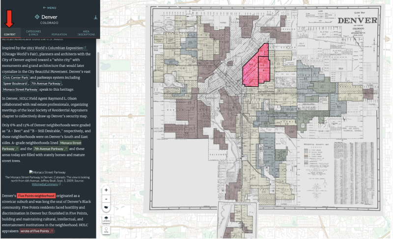
- Does the neighborhood you selected have a Context tab?
- If so, read the contextual essays and study the images. What new information does this provide?
- For those cities with area descriptions and/or contextual essays, did you find any evidence of racially restrictive covenants?
Now, zoom out and look at the placement of all the neighborhoods on the map. Practice using the layers tool to view the map in different ways (full map, categorized areas only, polygon).
- What patterns do you see?
- How are neighborhoods grouped in relation to industrial or commercial use areas?
- How are neighborhoods grouped in relation to bodies of water?
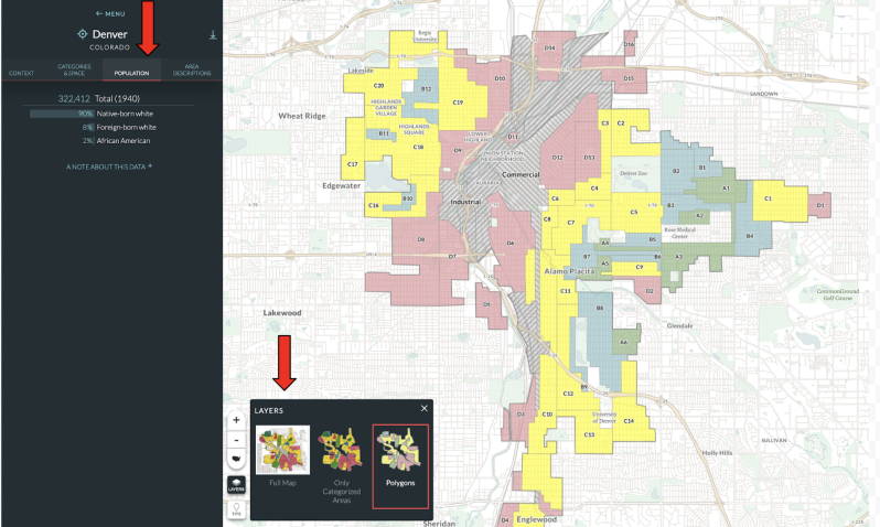
- How is population data represented on the map?
Turn and talk to a partner who explored a different city and map. Compare and contrast the city and map you explored with the one your partner explored. Discuss Nany similarities and differences.
Your teacher may ask you to record your answers on an exit ticket.
Explain:
Can we use historical maps and data to show a pattern of structural racism in New Deal America?
Return to the full view of the map using the US map icon.
Navigate back to the same city map you explored in the previous lesson. Be sure the map options are set back to "full map" view using the layers tool in the bottom left corner of the map.

Use the white hand icon tool and single-click on one of the green color-coded neighborhoods.
- What changes do you see on the map?
- How does the information on the left of the screen change?
Use the layers tool to select the polygons view of the map. Select the “Full” button. Take a few minutes to read about the green color-coded neighborhood.
- How is this neighborhood described?
- How does the description of the neighborhood reflect the HOLC or other score on the map key?
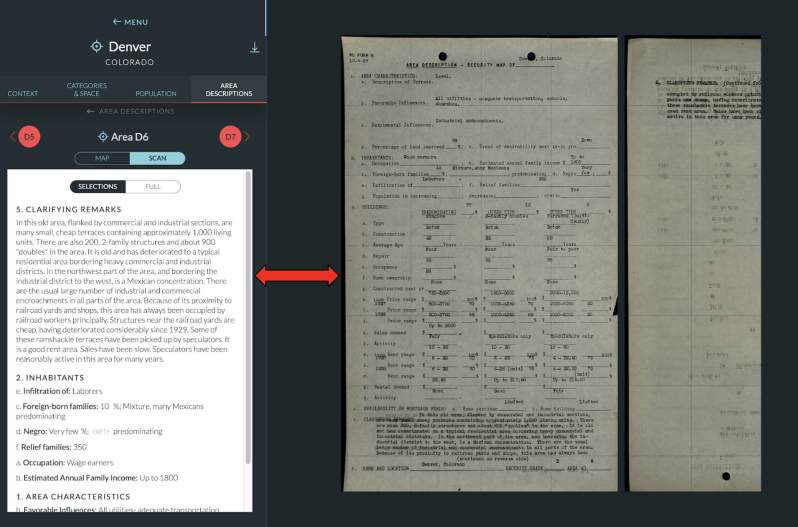
Click on the “Show Scan” button and read the primary source HOLC area description if one is available.
- What types of adjectives or descriptive words do you see?
- What else do you notice about the way certain neighborhoods are evaluated?
Select the “ Map” button to close the window when you are done reading to return to the map. Deselect (one click) the green color-coded section of the map you were viewing to return to the main map. Scroll down and view more selections from the Area Descriptions on the left side of your screen.
Repeat the same steps above with one of each of the other color-coded neighborhoods.
Select a blue, yellow, and finally a red neighborhood on the map by single-clicking on each type of neighborhood. Examine the map, the primary source HOLC documents and context essays (if available), and other information provided on the left side of the screen for each color-coded neighborhood..
Compare and discuss your findings with a partner who explored a different city and a different set of maps. Try to find a partner who explored a different type of map than you explored - ex. Pair up with a HOLC map explorer if you explored a non-HOLC map.
Pay careful attention to the language used on the maps and Area Descriptions/Context essays. Use the new keyword search feature at the top of the Area Descriptions to search for words you found repeated or interesting as you read the area descriptions or context essays.
Turn and talk to your partner about your thoughts on the language used to describe each neighborhood and city you explored.
- Do the color-coded regions in both cities show patterns that are consistent with structural racism?
- Did you discover segregationist language contained within the Area or Category Descriptions or in some cases, the Instructions to the HOLC agents?
Write a short paragraph describing how each of these neighborhoods varied in terms of property value, demographics of the inhabitants, and estimated income. Describe your thoughts on how this data relates to structural racism. Note specific words or phrases you see that show evidence of discriminatory language or patterns in each color-coded region. Document the city name, letter, and section with each example (ex.Denver D6).
Your teacher may ask you to record your answers on an exit ticket.
Elaborate:
How does the HOLC data represented in Mapping Inequality mirror modern-day structural racism?
In the 1980s discovery of the HOLC security maps in the National Archives changed the way historians thought about HOLC and New Deal housing policy. Housing activists in the 1960s and 1970s had criticized and protested discrimination in real estate lending and buying, coining the term “redlining” to illustrate the geographic dimensions of housing discrimination.
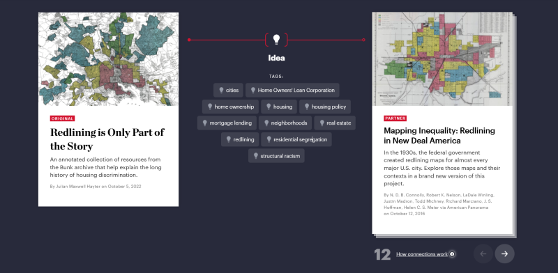
Read this excerpt from Redlining is Only Part of the Story from bunkhistory.org.
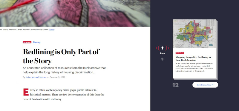
Notice the related content to the right of the excerpt. The stack of cards contains other articles, maps or content somehow connected to the original article on the left of the screen. As new content is added to Bunk, the related content and number of cards/connections (indicated by a gray number) will vary.
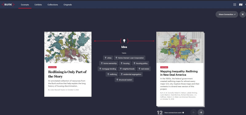
The connection icons located to the left of the cards here represent Idea, Person, Place and Time, which refers to a connected article from a later time period. These icons and the connected articles you see on the screen may change over time as new content is added to Bunk.
Select the “View Connections” button.
Notice how the screen changes.
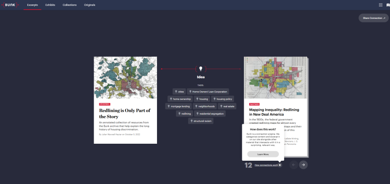
Select the “How Connections Work” icon and “Learn More” to read about how Bunk makes connections to its content.
Return back to the Redlining content by using your browser’s back arrow.
Below the connections icon, you will see a list of tags, manually curated for each piece of content to link the excerpt to other material from our archives that intersects with it in some way. Take a moment to view the list of tags.
- Do you notice anything about how these tags relate to the earlier learning activities you completed with the American Panorama map, Mapping Inequality?
- Are there any tags with new vocabulary or ideas not explored in your previous exploration of Mapping Inequality?
Select the arrow in the far right corner of the screen below the cards to view other cards, with new connections and tags. Each card will generate new connections and tags for each excerpt. Take some time to view these connections.
Note any similarities/differences between the tags.

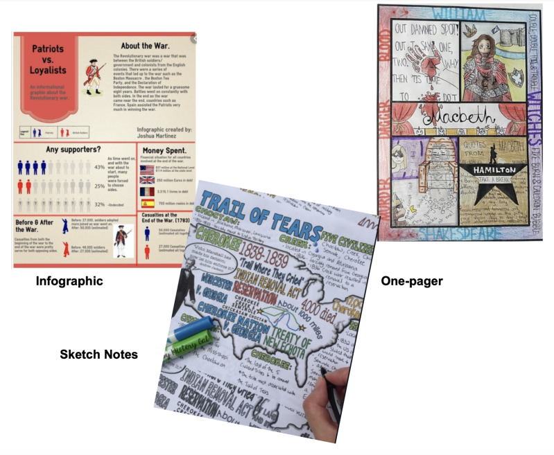
Working in groups of 3-4, each person in the group will select a different related card and read the excerpted article which is connected. Each person will prepare a visualization such as a 1-pager, infographic or sketch notes to summarize the main points of the Bunk content they read, and then these visualizations will be shared with the group. Your visualization should include suggested new tags for the article, or a new suggested connection from the list of Bunk connections viewed earlier.
Once all groups have completed their visualizations, display these around the classroom and spend time taking a gallery walk to view your classmates’ work.
- What do you notice about the ways redlining or structural racism are visualized?
- Can you think of other ways redlining continues to impact communities today?
Suggested resources for visualizations:
One-pagers: https://www.cultofpedagogy.com/one-pagers/
Infographics: https://www.commonsense.org/education/top-picks/best-infographic-design-apps-and-websites
Sketch Notes: https://creativeeducator.tech4learning.com/2016/articles/get-started-with-sketchnoting
Your teacher may ask you to record your answers on an exit ticket.
Citations:
Hayter, Julian Maxwell. “Redlining Is Only Part of the Story.” Bunk. New American History, October 5, 2022. https://www.bunkhistory.org/resources/10722.
Nelson, Robert K., LaDale Winling, et al. "Mapping Inequality: Redlining in New Deal America." Edited by Robert K. Nelson and Edward L. Ayers. American Panorama: An Atlas of United States History, 2023. https://dsl.richmond.edu/panorama/redlining.
"Shelley v. Kraemer." Oyez. Accessed September 7, 2023. https://www.oyez.org/cases/1940-1955/334us1.
“The Shelleys & the Right to Fair Housing.” iCivics. iCivics/Untold History, April 6, 2021. https://www.icivics.org/videos/shelleys-right-fair-housing.