

This work by New American History is licensed under a Attribution-NonCommercial-ShareAlike 4.0 (CC BY-NC-SA 4.0) International License. Permissions beyond the scope of this license may be available at newamericanhistory.org.
Southern Journey:
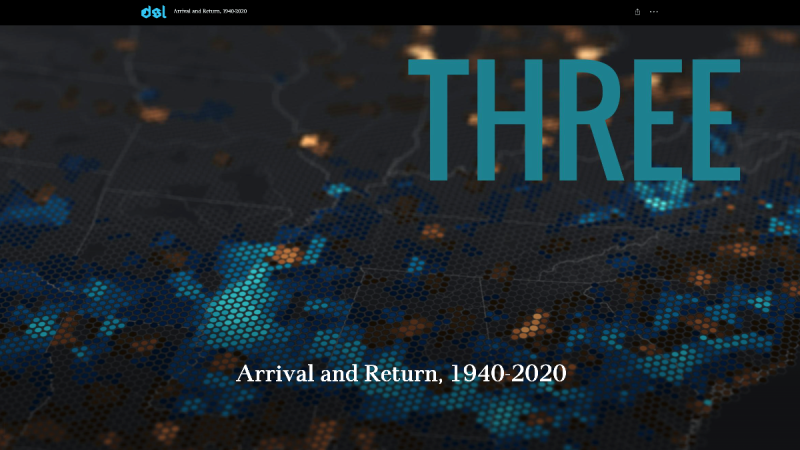
Arrival and Return, 1940-2020
Read for Understanding
This lesson uses mapping of many types to help understand demographics and demographic change, mostly in this case the movement of people by type or category. The maps and other data use statistics that describe populations and their characteristics. We look at recent changing migration patterns across the American South as well as the expansion and impact of the interstate highway system. We also look at the impact of the Census on minority populations and how understanding much of this can help fight a global pandemic.
Key Vocabulary
Cartographer - a mapmaker, a person who draws or produces maps
Census - an official count or survey of a population, typically recording data about individuals used for government planning and research
Cessions - the assignment of property to another entity. In international law, it commonly refers to land transferred by treaty
Commerce - the activity of buying and selling, especially on a large scale
Demographics - Demographics are the characteristics of a population that have been categorized by distinct criteria—such as age, gender and income—as a means to study the attributes of a particular group. Demographics help us understand the size, status, and behavior of populations.
Expulsion - the process of forcing someone to leave a place, especially a country, the forced removal of people from a location
Geospatial - relating to data that is associated with a particular location
Human settlement - a location where people have built structures to use as permanent or temporary living areas
Indigenous - originating or occurring naturally in a particular place; native
In-migration -the action of people moving into a new area in their country to live there permanently
Migration - the movement of people to a new area or country to find work or better living conditions
Movement: over time, physical and human phenomena change locations on the Earth’s surface
Out-migration - the action of leaving one place to settle in another, especially within a country
Population - all the inhabitants of a particular town, area, or country
Population Density - the number of people per square mile of land area
Racial/Restrictive Covenants - contractual agreements that prohibit the purchase, lease, or occupation of a piece of property by a particular group of people, usually African Americans, immigrants, or Jewish people
Redlining - the process by which banks and other institutions refuse to offer mortgages or offer worse rates to customers in certain neighborhoods based on their racial and ethnic composition
Rural - areas which are not towns or cities, often farming or agricultural areas
Spatial: Pertains to space and spatial relationships on Earth’s surface
Storymap - a web-based map integrating maps, legends, text, images, and multimedia elements to help users explore content and visualize data.
Urban - related to a city or large town, usually more densely populated
Urban Renewal -rehabilitation of city areas by renovating/replacing poorly maintained buildings with new housing, public buildings, parks, roadways, industrial areas, as part of a plan by state or local governments to revitalize a place, often resulting in displacing people of color with few opportunities for affordable housing and service
Engage:
How did migration patterns across the American South change in the post-World War II south?
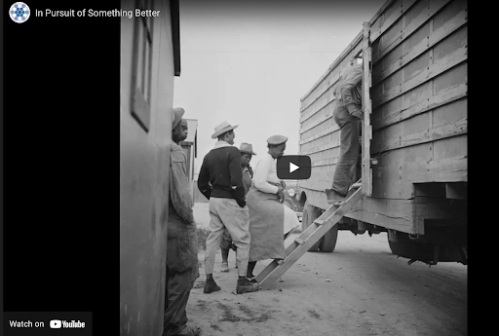
The patterns of human migration across the South shifted from rural to urban for both Black and white Southerners during and in the decades following World War II, sometimes called the Second Great Migration (1940-1970). This National Park Service “Ranger in Your Pocket” video describes how a second wave of the Great Migration began as African American families left the often violent racism of the South for opportunities in the North and West. (View, In Pursuit of Something Better.)
- Why is this time period referred to as The Great Migration?
- What is the difference between the first and second Great Migration?
- What surprised you about the video?
- What did you find most interesting?
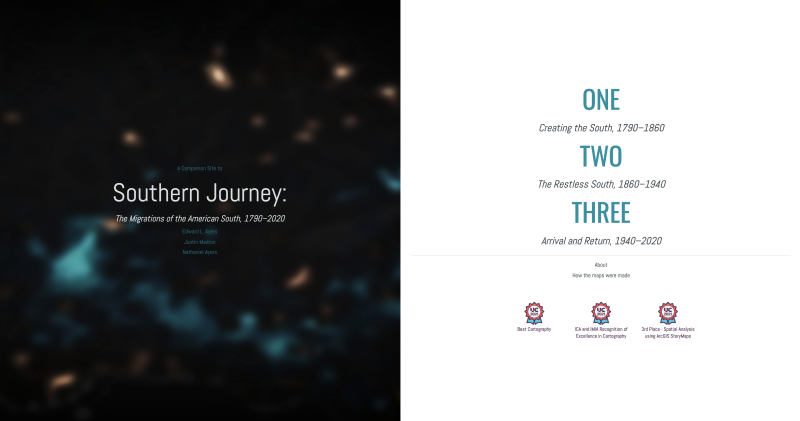
If you have explored the previous learning resources created to explore the Southern Journey: Migrations of the American South, 1790-2020 StoryMap, you are already familiar with how to navigate to tools and interpret the use of color to analyze patterns of human migration. If this is your first time using the map, you may wish to take some time to explore sections ONE and TWO on your own. These learning resources focus on the third section, “Arrival and Return, 1940-2020.”
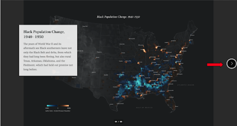
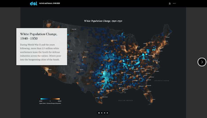
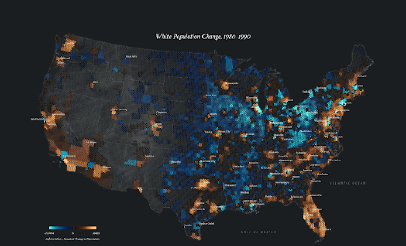
This StoryMap contains numerous maps comparing and contrasting the White population and Black population of the United States from 1940-2020. Some are presented as individual maps which may also be examined in closer detail as pop-out maps, while others use a vertical time slider tool for comparison. You will spend the majority of your time in this portion of the Learning Resources analyzing these maps, comparing and contrasting the patterns you see between both population subgroups. Remember to slow down and take your time as you scroll through each map. Take time to read the captions for each map. Pay close attention to the use of color on the maps. The maps show clear and striking patterns: shades of copper in the places where the number of people increased (migration) and those in blue where they declined (out-migration). The brighter the colors, the greater the change. The captions describe the most important patterns in each map. (Note, the gallery images below only represent a portion of the maps you will need to view in the online StoryMap, so be sure to locate and analyze all of the maps which appear with the black, copper, and blue color scheme.)
Scroll down to the map gallery of Black Population, 1940-1950. Analyze the maps in the gallery, using the right arrow to scroll through each decade, up to 1970-1980. Be sure to read each caption carefully as you explore the maps.
Continue to scroll down through the StoryMap to view the next map gallery, beginning with White Population, 1940-50 through 1970-80 in the same way as the previous maps were viewed.
- What do you notice?
- Compare and contrast the migration patterns you see on each set of maps. How are they alike?
- How are they different?
- What new ideas were most interesting to you as you analyzed the maps?
Your teacher may ask you to record your answers on an exit ticket.
Explore:
In what ways did the expansion of the interstate highway system unite and divide America?
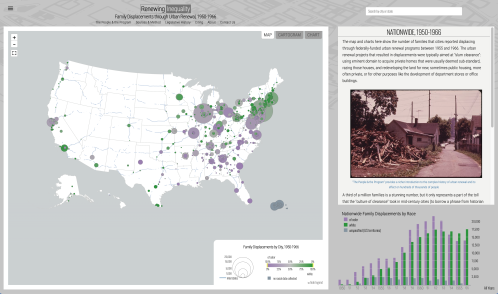
The expanding role of the federal government in the late 1940s through the early 1970s began both public and private redevelopment of American cities, further increasing racial and spatial inequalities that began with redlining in the New Deal Era. Renewing Inequality is a map created using national and local data on the federal Urban Renewal program, a World War II-era urban policy that reshaped large and small cities from the late 1940s and early 1950s, into the 1970s.
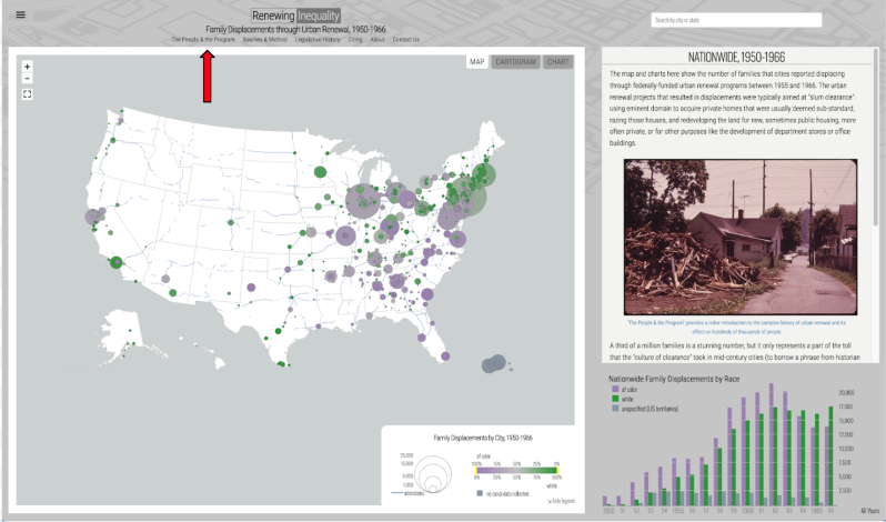
Take a few minutes to explore the map, selecting cities either nearby, or one you may have visited or heard about. You may click on the circles on the map, or type in a location in the search box.
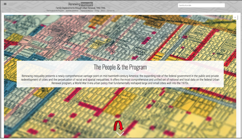
Next, explore the People and the Program tab, located at the top of the map just below the title. When you click on this tab, it will take you to a StoryMap similar to the Southern Journey one you have previously explored. You will use the white arrow located at the bottom of the screen to access the StoryMap. Spend some time exploring the StoryMap, either independently or with a partner, as directed by your teacher. (If working remotely, your teacher may allow you to collaborate with a partner via a collaborative document such as Google Docs or Google Slides, or via video conferencing.)
Just as you did with the Southern Journey StoryMap, take your time scrolling through and be sure to read the smaller text boxes and view the short videos embedded in the maps. Some of the maps include links out to view certain cities using the embedded Mapping Inequality link to a third map, as indicated by the red arrows in this map gallery. Be sure to use these images only to help guide you through the StoryMap.
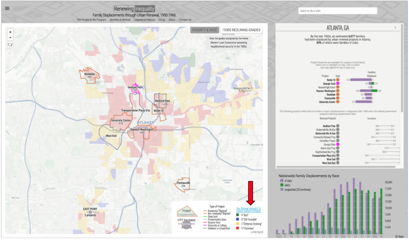
Notice you may select different views on these maps: Poverty and Race, or 1930s Redlining Grades (see buttons in the top right corner of the map.) As you select each one, notice the data in the map key changes. Select the map view for redlining.
Look for links in the map key to show you the original redlining maps for the city you selected to explore. Once you are there, select a neighborhood on the map. Read the data and area descriptions, using the information box on the left side of the screen, or view the original scanned documents using the “Show Scan” button located at the top of the box.
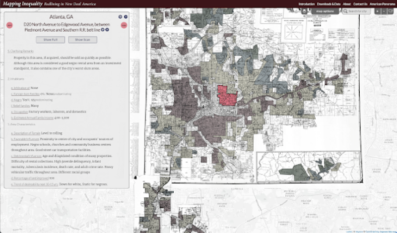
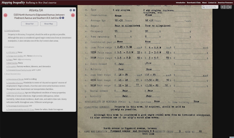
These scanned documents are primary sources, the original area descriptions and data collected to rate each neighborhood, assigning them a score to be used in determining which neighborhoods were good risks for banks to grant loans, or invest in improvements such as paved roads, landscaping, or recreation areas.

- How did the videos in the StoryMap help you better understand redlining and urban renewal?
- What do you notice about the maps and scanned documents you explored?
- What surprised you most about the StoryMap?
Now navigate back to the Southern Journey: Arrival and Return, 1940-2020 StoryMap. Scroll down the animated map of Interstate Highways. View the animation of the Interstate-highway network 1960-2000 in the StoryMap.
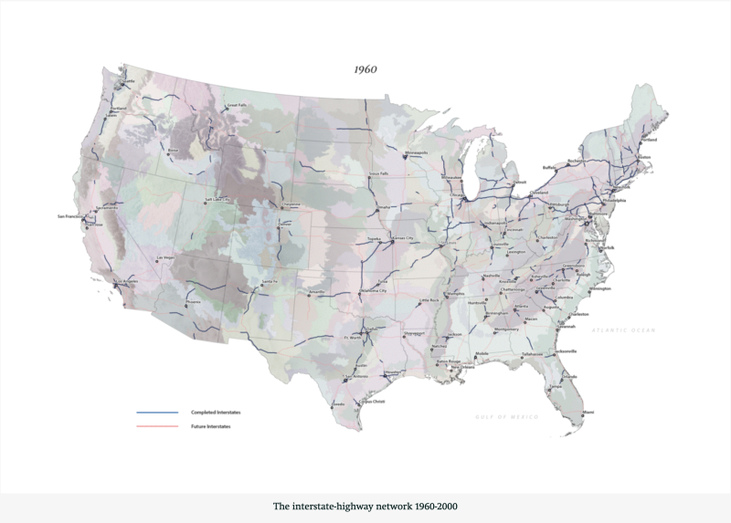
Now compare the animation to the city you explored in the Redlining maps and Urban Renewal earlier.
- What do you notice about the placement of the interstate highways in the animations and on the maps?
- What patterns do you see between the color-coded redlining maps and the placement of highways during urban renewal?
- Look back to the turquoise blue and copper-colored migration maps you viewed for Black and White populations between 1940-2020. Do you notice anything interesting about these maps compared to those of redlining and urban renewal?
- What do you notice about the communities you can view from your vehicle as you are driving or riding with others on the highways? What sorts of housing, businesses, and other development do you see on the landscape?
Your teacher may ask you to record your answers on an exit ticket.
Explain:
How are the demographics of the American population shifting in the South and across the country?
The 2020 Census was completed during a global health crisis, the COVID-19 pandemic. Some critics complained this led to an under-counted representation of minorities, children, and other key demographic populations. Despite these criticisms, the data results show the most diverse American population ever. Take a few minutes to explore this Bunk Connection.
- Compare and contrast the Bunk articles from the 2010-2020 Census. What do you notice?
- How might the pandemic have influenced the 2020 Census results?
- How has technology changed the way Census data is reported?
- What changes might this most recent data make as states redraw their Congressional maps?
- Do new technologies such as DNA Tests influence the results of the Census?
- How might we improve the process for the next generation to ensure all people are counted?
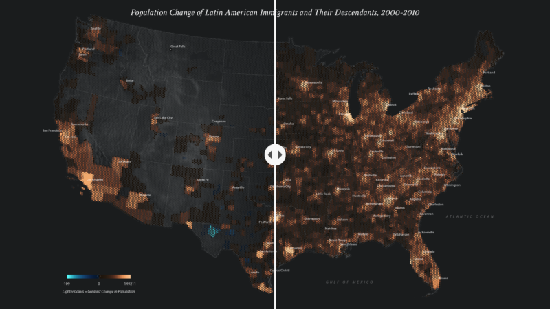
Next, explore the demographic migration patterns across the south in more recent history, using the Storymap, Southern Journey: Arrival and Return, 1940-2020. Scroll down to the section of the Storymap revealing Population Change of Latin American Immigrants and Their Descendants Comparison. Spend a few minutes analyzing the maps of Latin American Immigrants. Use the slider tool to move the maps back and forth, comparing the changes you see across the south and as populations shift in other directions.
Continue scrolling through the StoryMap and repeat the same process using the slider tool to analyze Population Change of Asian American Immigrants and Their Descendants Comparison.
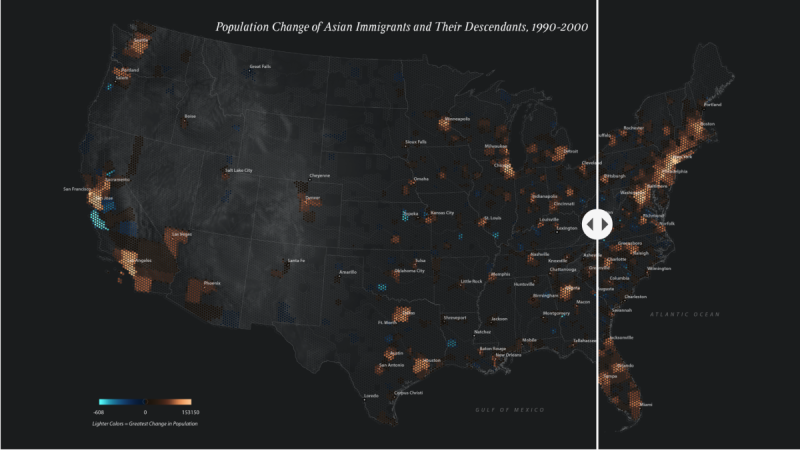
- Do you notice any similarities or differences between the migration patterns of each subgroup?
- What social, economic or political factors may have influenced these patterns over time?
- What predictions do you have about a future map drawn to reflect the 2020 Census data?
Next, continue scrolling through the StoryMap and take a look at a series of animations that zoom in on the more recent maps of White Population, noting the explanations for each shift.
Compare these changes to the maps of Black Population Change, 1980-90. Be sure to scroll through and read the text boxes for the map.
- How does this map compare to the outmigrations and in-migrations you viewed for the White population in the previous maps?
- What predictions do you have for future maps showing more recent data?
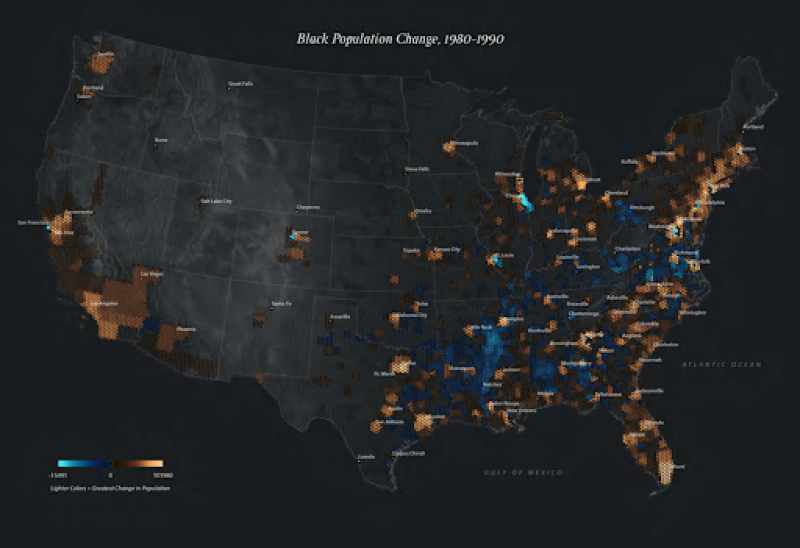
- How does this map compare to the outmigrations and inmigrations you viewed for the White population in the previous maps?
- What predictions do you have for future maps showing more recent data?
Lastly, examine this map of Domestic Migration, 2018. (Note: Maps for Hawaii and Alaska are currently available here).
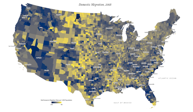
- Where do you see the largest population growth in the South?
- How does this compare to the 48 contiguous states?
- Where do you see the greatest decrease in population in the South?
- How does this compare to the 48 contiguous states?
- What predictions do you have for future maps once the 2020 Census data has been updated?
Your teacher may ask you to record your answers on an exit ticket.
Elaborate:
As Indigenous populations continue to advocate for greater recognition and federal funding, how might Census data strengthen their position?
Native peoples of the United States registered a 39 percent increase in the federal census between 2000 and 2010, growing twice as fast as the national population as a whole. In 2000 Americans were first presented the opportunity to self-identify with more than one race. Almost half of those who claimed American Indian identity claimed it along with another racial identity. Scroll through these maps of Populations of Self-Identified Indigenous Peoples, 2010. (Note: Maps for Hawaii and Alaska are currently available here). Use the right arrow to explore maps of the Cherokee, Seminole, Lumbee, Creek, and Choctaw Peoples.
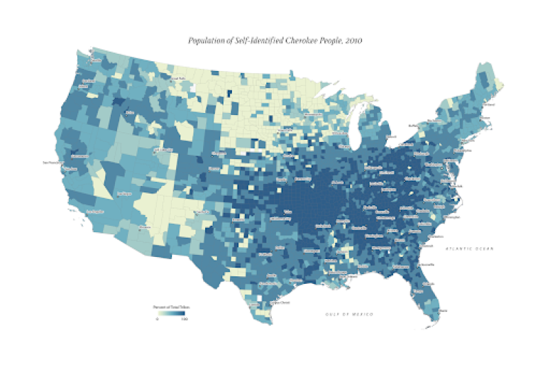
- What patterns do you notice as you analyze the various Indigenous Peoples?
- What surprised you about the maps?
- What questions do you have about the maps?
- Where might you find more information about these groups?
- What predictions do you have about future maps that might be drawn based on the 2020 Census?
Many states provide state recognition for Indigenous Peoples who may or may not have federal recognition status. Explore this topic using this Bunk Tag.
If your teacher or a trusted adult permits, you might reach out to a local Indigenous group in your area to discuss the differences between state and federal recognition, and how each one benefits the Indigenous peoples in your community. What might you do to help support these efforts? (Visit native-land.ca for information about contacting local Indigenous peoples in your community.)
Your teacher may ask you to record your answers on an exit ticket.
Extend:
How do migration patterns help us fight a global pandemic?
During the 2019-2021 school years, the global COVID-19 pandemic changed the ways we learn, work, communicate, shop and travel. This next series of maps show the connections between poor health, poverty, and COVID-19. Use the right arrow button to scroll through each map, and pay careful attention to the patterns you see across the Amerian south, taking time to read each of the text boxes shared on each map. (Note: Maps for Hawaii and Alaska are currently available here).
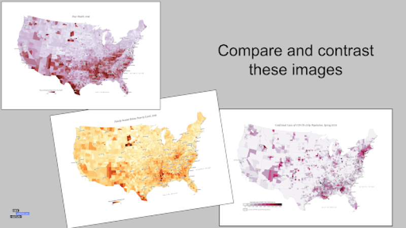
Compare the two COVID-19 maps from the spring and summer of 2020 to the most recent health data. You may use this data dashboard from the Johns Hopkins University of Medicine.
- How does the current health data compare to the previous year?
- What areas in the south are still most affected by the pandemic?
- What socio-economic factors might help explain this data?
- How might your community use these maps and the most recent data to make informed decisions?
Make a plan with your teacher and classmates to share this information and your ideas with leaders in your community. It might be a parent group such as the PTA, or a local government agency such as your City Council or Board of Supervisors.
We’d love to hear your ideas! If your teacher or a trusted adult allows, you may share them with us via email: editor@newamericanhistory.org or social media (links on our pages).
Your teacher may ask you to record your answers on an exit ticket.
Citations:
Ayers, Edward L., Justin Madron, and Nathaniel Ayers. “Creating the American South, 1790-1860.” ArcGIS StoryMaps. American Panorama/Digital Scholarship Lab, University of Richmond via Esri, November 9, 2020. https://storymaps.arcgis.com/stories/34e0e42dc461499f85b369b43f9e44f6.
Ayers, Edward L., Justin Madron, and Nathaniel Ayers. Southern Journey the Migrations of the American South, 1790-2020. Baton Rouge: Louisiana State University Press, 2020.
“Covid-19 Map - Johns Hopkins Coronavirus Resource Center.” COVID-19 Dashboard by the Center for Systems Science and Engineering (CSSE) at Johns Hopkins University (JHU). Johns Hopkins University and School of Medicine. Accessed November 1, 2021. https://coronavirus.jhu.edu/map.html.
“In Pursuit of Something Better.” YouTube. Atomic Heritage Foundation, National Museum of Nuclear Science & History, June 19, 2019. https://www.youtube.com/?gl=GB.
Digital Scholarship Lab, “Mapping Inequality,” American Panorama, ed. Robert K. Nelson and Edward L. Ayers, accessed December 14, 2021, https://dsl.richmond.edu/panorama/redlining/#loc=5/39.1/-94.58.
Digital Scholarship Lab, “Renewing Inequality,” American Panorama, ed. Robert K. Nelson and Edward L. Ayers, accessed December 14, 2021, https://dsl.richmond.edu/panorama/renewal/#view=0/0/1&viz=cartogram.