
This work by New American History is licensed under a Attribution-NonCommercial-ShareAlike 4.0 (CC BY-NC-SA 4.0) International License. Permissions beyond the scope of this license may be available at newamericanhistory.org.
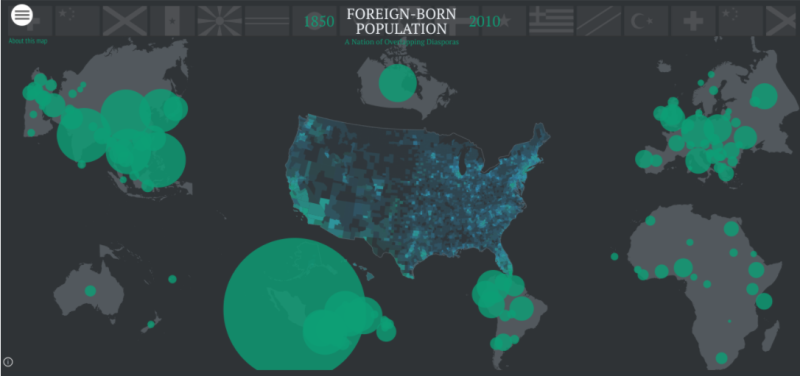
Foreign-Born Population (1850-2010)
Are We a Nation of Immigrants?
View Student Version
Standards
Common Core:CCSS: ELA-LITERACY.RI.4.7. Interpret information presented visually and explain how the information contributes to an understanding of the text in which it appears.
C3 Framework:D2.Geo.2.3-5. Use maps, satellite images, photographs, and other representations to explain relationships between the locations of places and regions and their environmental characteristics.D2.Geo.6.3-5. Describe how environmental and cultural characteristics influence population distribution in specific places or regions.
National Council for Social Studies:Theme 3: People, Places, and Environments
National Geography Standards: Standard 9: The characteristics, distribution, and migration of human populations on Earth's surface
Teacher Tip: Think about what students should be able to KNOW, UNDERSTAND and DO at the conclusion of this learning experience. A brief exit pass or other formative assessment may be used to assess student understandings. Setting specific learning targets for the appropriate grade level and content area will increase student success.
Suggested Grade Levels: Upper Elementary/Middle (4-8)
Suggested Time frame: 3 Sessions, 30 minutes per session
Suggested Materials: Internet access via laptop, tablet or mobile device
Key Vocabulary
Cartographer - A mapmaker.
Census - The official count of a population.
Immigrant - A person who comes to live permanently in a country other than the one where they were born.
Foreign-born - Born in another country than the country where they now live.
Read for Understanding
Teacher Tip:
This Learning Resource includes language in the body of the text to help adapt to a variety of educational settings, including remote learning environments, face-to-face instruction, and blended learning.
If you are teaching remotely, consider using videoconferencing to provide opportunities for students to work in partners or small groups. Digital tools such as Google Docs and Google Slides may also be used for collaboration. Rewordify helps make a complex text more accessible for those reading at a lower Lexile level while still providing a greater depth of knowledge.
This lesson may be adapted for more rigorous high school history courses with higher-level analysis questions, or for English Learners with appropriate scaffolding. The U.S. Census Bureau website has more information on foreign-born status as it relates to the data. Students may find it easier to open the map in a new browser tab or use the back arrow button to toggle between the lesson and the map. Students should view images live on the map, using the learning resources as a guide to follow along with the map on American Panorama.
This Learning Resource uses collaboration strategies like Turn and Talk to allow students to work with an “elbow partner” for brief collaborations, as well as critical thinking and literacy strategies like compare/contrast, analyzing maps, and the 3-2-1 strategy from Facing History. Connections are made by viewing the map in Bunk.
These Learning Resources follow a variation of the 5Es instructional model, and each section may be taught as a separate learning experience, or as part of a sequence of learning experiences. We provide each of our Learning Resources in multiple formats, including web-based and as an editable Google Doc for educators to teach and adapt selected learning experiences as they best suit the needs of your students and local curriculum. You may also wish to embed or remix them into a playlist for students working remotely or independently.
For Students:
At all points in its history, a significant proportion of the population of the United States had been born in other countries and regions. This being the case, American history can never be understood by just looking within its borders. The culture and politics of the US have always been shaped by the material and emotional ties many of its residents have had to the places where they were born. This map will allow you to begin to explore those connections at the basic level of demographic statistics. Use this map to explore those connections and answer the question, “Are we a Nation of Immigrants?”
Engage:
Can maps help tell a story about the population/settlement patterns of the United States?
Click on the Map URL above. Read the introduction and click NEXT
Read “How to Use This Map” and click ENTER
Take 5 minutes to explore the map and its tools. What do you notice?
- Turn and talk to a partner. If working remotely, use the chatbox or another collaboration strategy such as Google Docs or Google Slides, as recommended by your teacher.
- Share 3 things you noticed on the map, 2 things you wonder about the map and 1 thing you learned about the map so far.
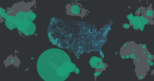
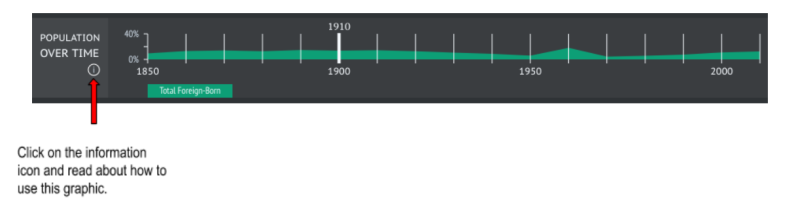
Locate this population graphic in the bottom left corner of the map:
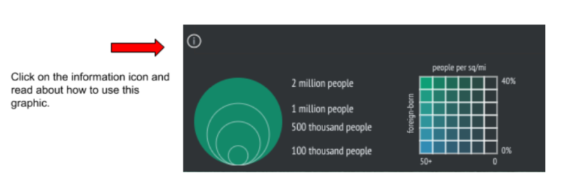
The green circles indicate how many people in the US were born in that country in a given year.
- How many people are represented by the smallest of the green circles? The largest?
- Use the graph on the right to describe in a sentence how the colors are used to relate information about population density (the number of people per sq. mile).
Now let’s focus on the map:
- What do you notice about the size, shape, and location of each of the continents on this map? Is the map an accurate representation of our Earth? Turn and talk to a partner about these questions. Discuss why the cartographer might have created the map in this way. If working remotely, use the chatbox or another collaboration strategy such as Google Docs or Google Slides, as recommended by your teacher.
- Where do you see the largest of the green circles on the map? Where do you see fewer or smaller green circles? What does this tell you about the foreign-born population on each continent?
- Focus on the part of the map which shows the United States. What do you notice about how the colors are used on the map to explain the population density? Where are most foreign-born people living in the US? Why might they have settled here?
Your teacher may ask you to record your answers on an exit ticket.
Explore:
How has the foreign-born population density of the United States changed over time?
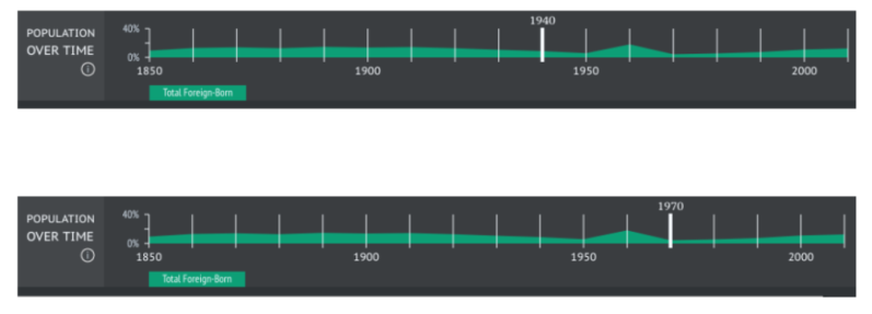
Locate this population timeline graphic in the bottom right corner of the map:
- How was the data used to make this map and the graphics collected?
- Do you think this data is accurate? Turn and talk to a partner about your thoughts. If working remotely, use the chatbox or another collaboration strategy such as Google Docs or Google Slides, as recommended by your teacher.
- You may go back to the information icon for help.
- This graphic has a slider tool. The thicker white line can slide between decades to show population changes over time. Take a few minutes to move the slider and observe how the data changes.
- How does the map change if you slide the tool over each decade of time? In what time periods are there the greatest number of foreign-born people on each continent?
- What patterns do you notice on the map as you slide the tool between each decade?
- How does the US population change on the map?
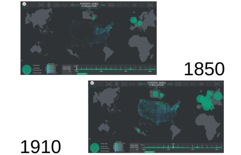
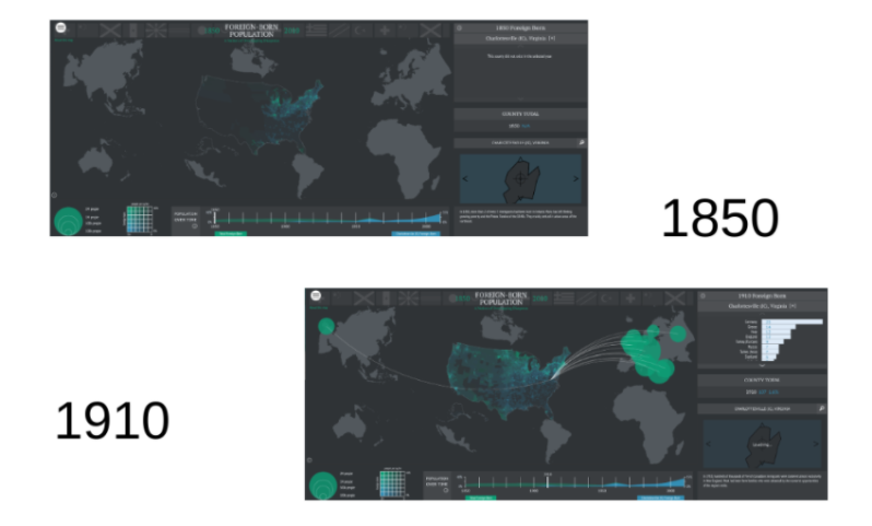
Now let’s focus on these years: 1850 and 1910.
- What changes do you notice on the map comparing the data over this period of time?
- Think about what events or conditions going on in the country during this time might help explain these changes. Where might you find more information to help you think about these changes?
What predictions can you make about the US population if you slide the tool all the way to the right? Turn and talk to a partner about your predictions. When both of you have shared, move the slider to the far right and see if your predictions were accurate.
- Did the foreign-born population in the US increase, decrease or stay the same?
- What factors might explain these changes?
- What changes do you notice on other continents?
The US Census Bureau collected population data again in the US in the year 2020.
- What changes do you think you might see?
- What factors might explain these changes?
Your teacher may ask you to record your answers on an exit ticket.
Explain:
How does the population of foreign-born people in your community compare to other locations?
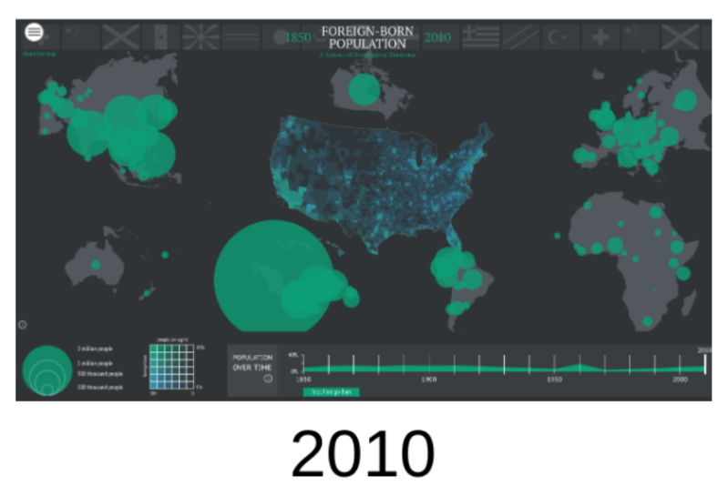
Locate the bar graph of foreign-born people by country of origin, located in the top right corner of the map. Move the slider tool at the bottom of the map all the way to the far right, in the year 2010, so it matches the image below. Click on the information icon and read about how to use this graphic.
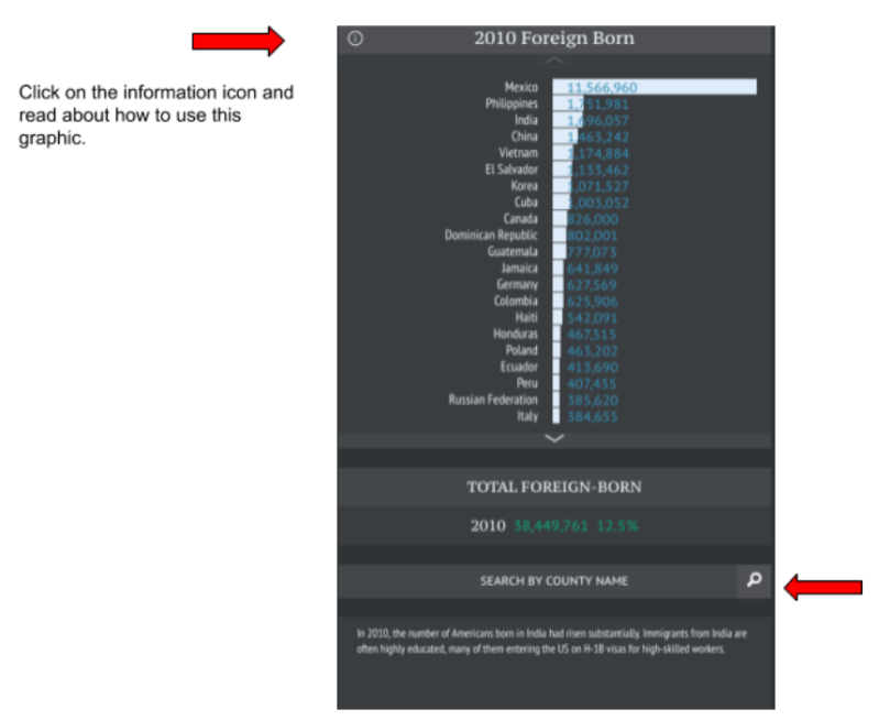
Take a few minutes to study the bar graph on your own.
- What surprises you the most?
- In 2010 what percentage of the population was foreign-born in the US?
- From what country did the most foreign-born people originate?
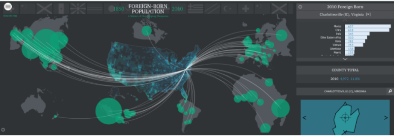
Maps and data can help us drill down to very specific locations to tell a story. Locate the magnifying glass in the “Search by County Name” box and type in the county (or city) closest to where you live.
- When you hit the enter key, how does the map change? Take time to explore the map.
- What do you think the white lines represent? How do these lines compare to the bar graph?
Use the slider tool to see how this may have changed over time.
- Which country had the largest migrant population in your community in any given year? Share with a partner your results for 1850, 1910 and 2010. If working remotely, use the chatbox or another collaboration strategy as recommended by your teacher.
Now select the decade in which you were born.
- How has the data changed? Select another neighboring county or city.
- How does the foreign-born population data compare to your location?
- Do you have any thoughts about which countries are represented by the population in your community?
Your teacher may ask you to record your answers on an exit ticket.
Elaborate:
What are some of the factors influencing the countries of origin for the foreign-born people in the US?
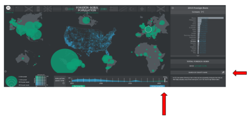
Use the slider tool to move the slider all the way to the right for the most current Census data. Be sure to clear the Search by County Name box under the bar graph on the right side of the map.
Now select one of the countries of origin on the bar graph located to the right of the map. Highlight the name of a country by double-clicking on it — a text box should appear with more information about that country. Select and read more about 3-4 countries on the graph. Be sure to pick a few on different continents.
- What surprised you the most about one of the countries you read about on the graph?
- What similarities did you notice, if any?
- What differences did you notice, if any?
- Select some of the countries on the map and click on them. The name of the country should be highlighted on the graph to the right. See if you can locate the countries you read about as they appear on the map.
- Some of your family members, classmates or neighbors may have been born in a foreign country. Take an informal poll or ask them if they can help you locate their country of origin. Ask them to share a story or memory they may have about their country of origin. If working remotely, you may want to use tools such as the chatbox, Google Docs or Google Slides, as recommended by your teacher.
- You may want to ask your school librarian if there are any books in your library that were written about one of these countries you have explored.
Now explore the map using Bunk, a powerful tool for helping make historical connections. As you navigate through the various connections, continue to refer back to the map and think about how each connection or tag relates to the content you previously explored. What other tags might you suggest for an interesting connection you found? You can share the connection and your ideas for a new tag with us via email at editor@newamericanhistory.org or if your teacher or a trusted adult permits you may share via social media (links on our pages).
Your teacher may ask you to record your answers on an exit ticket.
Citations:
Nelson, R. K., Nesbit, S., Ayers, E. L., Madron, J., & Ayers, N. (n.d.). “Foreign Born” in American Panorama, ed. Nelson and Edward L. Ayers, https://dsl.richmond.edu/panorama/foreignborn/#decade=2010.
View this Learning Resource as a Google Doc