
This work by New American History is licensed under a Attribution-NonCommercial-ShareAlike 4.0 (CC BY-NC-SA 4.0) International License. Permissions beyond the scope of this license may be available at newamericanhistory.org.
The lines that shape our cities: Redlining & Environmental Inequalities
How has the practice of redlining affected the physical environment of neighborhoods?
Read for Understanding:
While many books, essays and articles have been written about the socio-economic effects of redlining, more recently researchers are using Geographic Information Systems (GIS) analysis to uncover relationships between redlined areas and environmental conditions such as tree canopy coverage, temperature, infrastructure, and topography. This type of analysis can help identify correlations between historically redlined areas and environmental inequalities.
Key Vocabulary
Assessor - a person who estimates the value of something, in this case land
Home Owners’ Loan Corporation (HOLC) - an agency created in 1933 by U.S. President Franklin D. Roosevelt’s New Deal that attempted to prevent foreclosures by refinancing home mortgages in default; created a color-coded grading system that assessed the credit-worthiness of city neighborhoods
Impervious surfaces - man-made land surfaces such as sidewalks, roads, parking lots that are covered by materials that water cannot penetrate, such as asphalt, concrete, or gravel
The New Deal - President Franklin D. Roosevelt’s program to help solve the economic problems triggered by the Great Depression
Redlining - the practice of mortgage lenders of drawing red lines around portions of a map to indicate areas or neighborhoods in which they do not want to make loans.
StoryMap - a web-based map integrating maps, legends, text, images, and multimedia elements to help users explore content and visualize data.
Suburbs - an area outside of a city that is primarily residential
Topography - the arrangement of physical features of a land’s surface
Tree canopy coverage - the proportion of an area shaded by trees
Urban heat island - occurs when a city experiences much warmer temperatures than nearby rural areas
Engage
How can words shape neighborhoods?
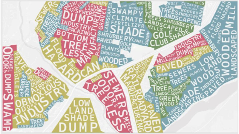
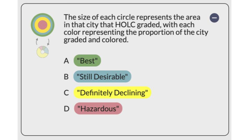
In the 1930s, city assessors supported by the federal government under The New Deal rated more than 200 city neighborhoods. The ratings were based on how good of an investment they would be for banks and real-estate developers: “A” meant the “best” investment, “D” meant the investment was “hazardous.” The work of these assessors shaped the future social, economic, and environmental life of these places.
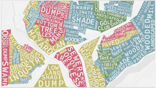
First, view an excerpt from this StoryMap as connected in Bunk. Then, go back and examine the WordCloud that shows common descriptors for each of the four ratings.
The Lines That Shape Our Cities
Connecting present-day environmental inequalities to redlining policies of the 1930s.
www.bunkhistory.org
Using the reading and the WordCloud, your teacher will lead a discussion using the “See, Think, Wonder” thinking routine. Share your ideas in small groups or with the whole class. If working remotely, you may use breakout rooms through videoconferencing or share via a collaborative document such as Google Docs or Google Slides.
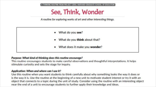
See, Think, Wonder
Project Zero Thinking Routine
pz.harvard.edu
After the discussion, read the introduction to this StoryMap, entitled “The lines that shape our cities”.

The lines that shape our cities
Connecting present-day environmental inequalities to redlining policies of the 1930s
storymaps.arcgis.com
As you read, make a copy and complete Part 1 of this Reading Guide.
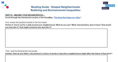
NAH Reading Guide -Shaped Neighborhoods
PART #1 - IMAGINE YOUR NEIGHBORHOOD… Scroll through the Introduction section of the StoryMap, “The lines that shape our cities.” First, answer the questions asked on the first screen. Picture it: You're out for a walk around your neighborhood. What do you see? What characteristics does it have? ...
docs.google.com
Next, in a group of 3 or 4, complete Part 2 of the Reading Guide, which uses Project Zero’s “Creative Question Starts”.

Creative Question Starts
Project Zero Thinking Routine
www.pz.harvard.edu
After you complete Part #2, each group shares their best question and their reflections with the whole class.
If working remotely, you may use breakout rooms through videoconferencing or share via a collaborative document such as Google Docs or Google Slides.
Your teacher may ask you to record your answers on an exit ticket.
Explore
How has redlining been connected to environmental inequalities?
During the Great Depression, the administration of U.S. President Franklin D. Roosevelt started implementing social aid programs as part of The New Deal to help struggling Americans. One such agency was the Home Owners Loan Corporation (HOLC). It gave more than one million emergency refinancing loans to homeowners between 1933 and 1936, including loans to people of color and immigrants. The HOLC also created a color-coded mapping system that rated neighborhoods based on how good of an investment they would be for banks and real-estate developers: Green indicated the “best” investment opportunities, and red indicated“hazardous.” However, the HOLC’s process for making these maps was subjective and was often based on the racial and ethnic composition of neighborhoods. Out of the HOLC color-coded map system came the term redlining, and historians continue to debate its impact on city neighborhoods today.
Recent scholarship has connected the socio-economic effects of redlining with environmental inequalities today. Learn more about these relationships by selecting the “Legacy” tab of the American Panorama StoryMap entitled “The lines that shape our cities.”
The lines that shape our cities
Connecting present-day environmental inequalities to redlining policies of the 1930s
storymaps.arcgis.com
Choose one of the four case studies that investigate the relationship between redlining and the urban environment today:
- Urban heat islands in St. Louis, Missouri
- Tree canopy coverage in Montgomery, Alabama
- Impervious surfaces in Fort Wayne, Indiana
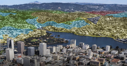
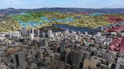
- Topography in Oakland, California
Then, find the tab that relates to your chosen case study. Select and read through all of the corresponding information.
Make a copy and complete this Data Organizer as you read and examine the case study.
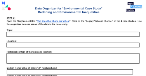
NAH Data Organizer for “Environmental Case Study”
STEP #1 Open the StoryMap entitled “The lines that shape our cities.” Click on the “Legacy” tab and choose 1 of the 4 case studies. Use this organizer to make sense of the data in the case study. Topic: Location: Historical context of the topic and location: Median Home Va...
docs.google.com
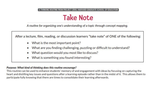
When you finish the Data Organizer, use your findings to answer one of the questions below, using the “Take Note” Thinking Routine:
- What is the most important point?
- What are you finding challenging, puzzling, or difficult to understand?
- What question would you most like to discuss?
- What is something you found interesting?

Take Note
Project Zero Thinking Routine
pz.harvard.edu
To share your response, your teacher may provide access to a Google Doc discussion board, or allow you to collaborate on a Google Slides set. Your teacher will debrief by reviewing the main ideas of each piece and by reading back student responses to the class and asking follow-up questions or by asking you to turn and talk to a partner to share your answers.
Your teacher may ask you to record your answers on an exit ticket.
Explain
How did redlining, as defined by the HOLC maps, affect a neighborhood’s physical environment?
Click on the “Brief History” tab of “The lines that shape our cities”.
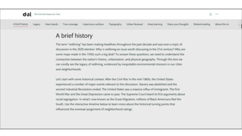
The lines that shape our cities
Connecting present-day environmental inequalities to redlining policies of the 1930s
storymaps.arcgis.com
Read through this section carefully. Make a copy and complete this 3-2-1 graphic organizer after you read.
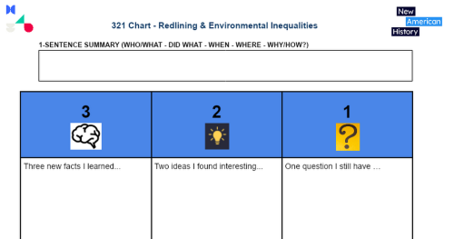
NAH 321 Chart - Redlining & Environmental Inequalities
1-SENTENCE SUMMARY (WHO/WHAT - DID WHAT - WHEN - WHERE - WHY/HOW?) 3 2 1 Three new facts I learned... Two ideas I found interesting... One question I still have … 321 Chart - Redlining & Environmental Inequalities
docs.google.com
After reading about the broader historical context of how the HOLC maps and ratings originated redlining, examine those maps more closely. Open the map entitled “Mapping Inequality.” Choose one of the four cities addressed in the StoryMap and previous “Explore” section of this learning resource: St. Louis, MO; Montgomery, AL; Fort Wayne, IN; or Oakland, CA.
Use the search bar in the upper right corner to find data on the city you selected.
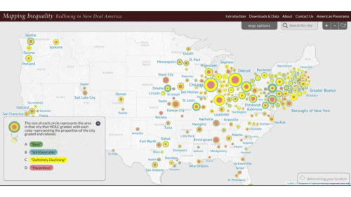
Mapping Inequality
Redlining in New Deal America
dsl.richmond.edu
Once the data appears, click on one area that is colored green and graded “A.” Click on “Show Full” to read the profile description created by the HOLC.
Note: If you choose St. Louis, use the map for East St. Louis, Illinois. (There are no clarifying remarks for St. Louis, Missouri.)
Repeat for one area of the same city that is colored red (D), yellow (C), and blue (B).
Make a copy and complete this Data Organizer, which will organize and guide your interpretation of the data.
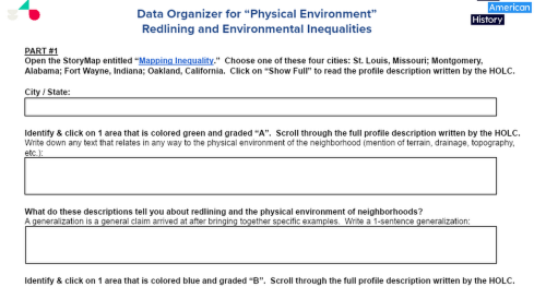
NAH Data Organizer for “Physical Environment”
PART #1 Open the StoryMap entitled “Mapping Inequality.” Choose one of these four cities: St. Louis, Missouri; Montgomery, Alabama; Fort Wayne, Indiana; Oakland, California. Click on “Show Full” to read the profile description written by the HOLC. City / State: Identify & click on 1 a...
docs.google.com
Complete the Exit Questions in Part 2 of the Data Organizer.
Then, answer this question as a large group discussion led by your teacher with your class:
How did the HOLC’s maps affect the development of a neighborhood’s physical environment?
Your teacher will debrief by reading back student responses to the class and asking follow-up questions or by asking you to turn and talk to a partner to share your answers.
Your teacher may ask you to record your answers on an exit ticket.
Elaborate
How did redlining contribute to the creation of the suburbs?
The HOLC’s maps and rating system contributed to the creation of suburbia in America. Learn more about this relationship by exploring this Bunk Connection. Watch “The Disturbing History of the Suburbs” and read “American Green.”
The Disturbing History of the Suburbs
Redlining: the racist housing policy from the Jim Crow era that still affects us today.
www.bunkhistory.org
Before you read and watch, review the questions in the “Take Note” Thinking Routine. After you read and watch, you will choose one of the following questions to answer. As you read, don’t try to take notes at the same time, just focus on becoming fully engaged in the reading:
- What is the most important point?
- What are you finding challenging, puzzling, or difficult to understand?
- What question would you most like to discuss?
- What is something you found interesting?
Take Note
Project Zero Thinking Routine
pz.harvard.edu
When you finish reading, answer one of the “Take Note” questions above. Your teacher may provide access to a Google Doc discussion board, or allow you to collaborate on a Google Slides set. Your teacher will debrief by reading back student responses to the class and asking follow-up questions or by asking you to turn and talk to a partner to share your answers.
Lastly, you will end with a discussion of this Exit Question, using ideas from the reading and clip:
How did redlining contribute to the creation of the suburbs?
Your teacher may ask you to record your answers on an exit ticket.
The Lines That Shape Our Cities
Connecting present-day environmental inequalities to redlining policies of the 1930s.
www.bunkhistory.org
Applying what you’ve learned from this lesson, your teacher will lead a class discussion using the “I Used To Think…Now I Think” thinking routine. You will explain how your thinking on redlining and environmental inequalities has changed since the start of this lesson.
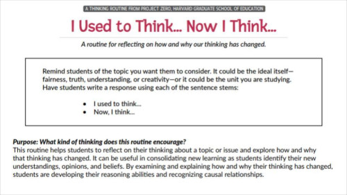
I Used to Think... Now I Think...
Project Zero Thinking Routine
pz.harvard.edu
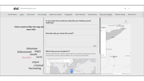
Click on the “Share your thoughts” tab of the StoryMap called “The lines that shape our cities.”
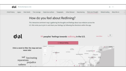
The lines that shape our cities
Connecting present-day environmental inequalities to redlining policies of the 1930s
storymaps.arcgis.com
Then, click on 3 different words located to the left of the interactive sentiment map. For each word, read the comment box that accompanies it. Make a copy and complete this Map Guide to organize your thoughts and reflections.
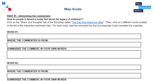
Map Guide (Redlining & Environmental Inequalities)
PART #1 - Interpreting the commentary How do people in America today feel about the legacy of redlining?? Click on the “Share your thoughts” tab of the StoryMap called “The lines that shape our cities”. Then, click on 3 different words located to the left of the interactive sentiment map. For e...
docs.google.com
After you complete the Map Guide, click on the red “Add your feeling” button on the sentiment map. Complete the text box to submit your feelings about redlining.
The lines that shape our cities
Connecting present-day environmental inequalities to redlining policies of the 1930s
storymaps.arcgis.com
Your teacher may ask you to record your answers on an exit ticket.
Citations:
“The Disturbing History of the Suburbs: Adam Ruins Everything.” YouTube. Adam Ruins Everything, October 4, 2017. https://youtu.be/ETR9qrVS17g.
“The Lines That Shape Our Cities.” ArcGIS StoryMaps. Esri, March 8, 2022. https://storymaps.arcgis.com/stories/0f58d49c566b486482b3e64e9e5f7ac9.
“Project Zero's Thinking Routine Toolbox.” PZ's Thinking Routines Toolbox | Project Zero. Accessed July 12, 2022. https://pz.harvard.edu/thinking-routines.
Robert K. Nelson, LaDale Winling, Richard Marciano, Nathan Connolly, et al., “Mapping Inequality,” American Panorama, ed. Robert K. Nelson and Edward L. Ayers, accessed July 7, 2022, https://dsl.richmond.edu/panorama/redlining.
Steinberg, Ted. “American Green.” Longreads. Longreads, July 12, 2019. https://longreads.com/2019/07/18/american-green/.