
This work by New American History is licensed under a Attribution-NonCommercial-ShareAlike 4.0 (CC BY-NC-SA 4.0) International License. Permissions beyond the scope of this license may be available at newamericanhistory.org.
Southern Journey: Creating the South, 1790–1860
A collaboration with Seizing Freedom and VPM
View Student Version
Standards
Common Core:CCSS.ELA-LITERACY.RH.6-8.7Integrate visual information (e.g., in charts, graphs, photographs, videos, or maps) with other information in print and digital texts.CCSS.ELA-LITERACY.RH.11-12.7Integrate and evaluate multiple sources of information presented in diverse formats and media (e.g., visually, quantitatively, as well as in words) in order to address a question or solve a problem.
C3 Framework:D2.His.3.6-8. Use questions generated about individuals and groups to analyze why they, and the developments they shaped, are seen as historically significant.
National Geography Standards: Standard 4. The physical and human characteristics of places.Standard 6. How culture and experience influence people’s perceptions of places and regions.
C3 Framework:D2.His.3.6-8. Use questions generated about individuals and groups to analyze why they, and the developments they shaped, are seen as historically significant.
D2.His.3.9-12. Use questions generated about individuals and groups to assess how the significance of their actions changes over time and is shaped by the historical context.
D2.His.12.6-8. Use questions generated about multiple historical sources to identify
D2.His.6.9-12. Analyze the ways in which the perspectives of those writing history shaped the history that they produced.
D2.His.12.6-8. Use questions generated about multiple historical sources to identify further areas of inquiry and additional sources
D2.His.12.9-12. Use questions generated about multiple historical sources to pursue further inquiry and investigate additional sources.
D2.Geo.7.9-12. Analyze the reciprocal nature of how historical events and the spatial diffusion of ideas, technologies, and cultural practices have influenced migration patterns and the distribution of human population.
National Council for Social Studies:Theme: Time, Continuity, ChangeTheme: CultureTheme: People, Places, and EnvironmentsNational Geography Standards: Standard 4. The physical and human characteristics of places.Standard 6. How culture and experience influence people’s perceptions of places and regions.
Teacher Tip: Think about what students should be able to KNOW, UNDERSTAND and DO at the conclusion of this learning experience. A brief exit pass or other formative assessment may be used to assess student understandings. Setting specific learning targets for the appropriate grade level and content area will increase student success.
Suggested Grade Levels: Middle School/High School
Suggested Timeframe: Three 90 minute class periods/blocks
Suggested Materials: Internet access via laptop, tablet or mobile device, or projector and screen for viewing video segments as a whole group if providing face to face instruction. Access to video conferencing if providing instruction via remote learning or hybrid teaching models.
Key Vocabulary
Cartographer - a mapmaker, a person who draws or produces maps
Census - an official count or survey of a population, typically recording data about individuals used for government planning and research
Cessions - The assignment of property to another entity. In international law, it commonly refers to land transferred by treaty.
Commerce - the activity of buying and selling, especially on a large scale
Expulsion - the process of forcing someone to leave a place, especially a country, the forced removal of people from a location
Geospatial - relating to data that is associated with a particular location.
Indigenous - originating or occurring naturally in a particular place; native
Human settlement - A location where people have built structures to use as permanent or temporary living areas
Incursion - an invasion or attack, especially a sudden or brief one
Migration - the movement of people to a new area or country to find work or better living conditions
Movement - Over time, physical and human phenomena change locations on the Earth’s surface
Out-migration - the action of leaving one place to settle in another, especially within a country.
Parish - a church district, the members of a particular church or a county-type division in Louisiana
Population - all the inhabitants of a particular town, area, or country
Population Density - the number of people per square mile of land area
Spatial - How objects fit together, either among the planets or on the earth's surface.
Storymap - a web-based map integrating maps, legends, text, images, and multimedia elements to help users explore content and visualize data.
Read for Understanding
Teacher Tips:
This Learning Resource includes language in the body of the text to help adapt to a variety of educational settings, including remote learning environments, face-to-face instruction, and blended learning.
If you are teaching remotely, consider using videoconferencing to provide opportunities for students to work in partners or small groups. Digital tools such as Google Docs or Slides may also be used for collaboration. Rewordify helps make a complex text more accessible for those reading at a lower Lexile level while still providing a greater depth of knowledge. This tool is useful for students when reading excerpts in Bunk or analyzing quotes.
This Learning Resource is one of a three-part series developed in collaboration with the Digital Scholarship Lab at the University of Richmond, based on the ESRI StoryMap, Southern Journey, a companion digital humanities project created by the authors of Southern Journey: The Migrations of the American South, 1790–2020. For more information about the forced migration of enslaved Africans, you may wish to have students analyze the American Panorama map, Forced Migration in the American South, in more depth before this lesson. For more information about StoryMaps, visit the ESRI website and register for a free educator account.
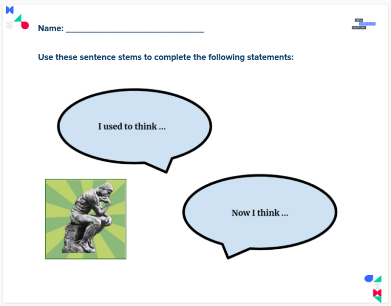
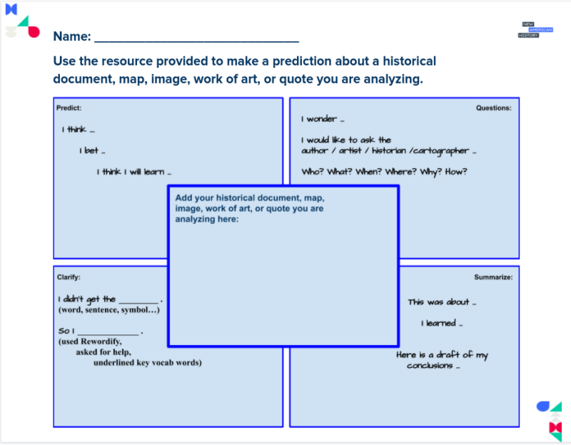
Project Zero, from the Harvard Graduate School of Education, developed a series of Thinking Routines to activate critical thinking. This learning resource includes their visible thinking routine, I Used to Think, But Now I Think… which may be shared with students as a graphic organizer. Reciprocal teaching strategies build students’ reading comprehension when encountering a challenging piece of text, such as a primary source document or historical quote. Students may use this graphic organizer to help them when predicting, questioning, clarifying, or summarizing.
These Learning Resources follow a variation of the 5Es instructional model, and each section may be taught as a separate learning experience, or as part of a sequence of learning experiences. We provide each of our Learning Resources in multiple formats, including web-based and as an editable Google Doc for educators to teach and adapt selected learning experiences as they best suit the needs of your students and local curriculum. You may also wish to embed or remix them into a playlist for students working remotely or independently.
For Students:
When the United States became an independent country, it was just the thirteen original colonies. Today it is a vastly bigger country and that growth came from migration. This lesson looks at how migration spread south in the early years of the new country, and why it is important to study that movement. Importantly we also look at who was displaced and who owned or controlled the land.
Engage:
What lessons might we learn by visualizing migration patterns of our nation’s beginnings?
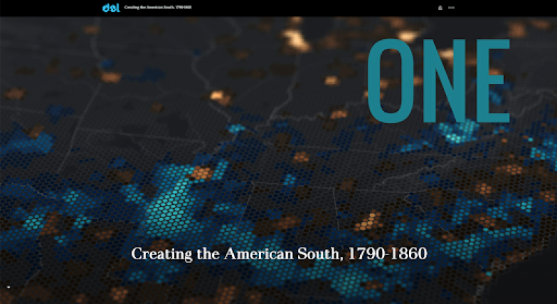
The maps you will be analyzing in this learning experience are from the Southern Journey: ONE Creating the American South, 1790-1860 StoryMap, and are unlike any other you may have seen before. They were created using Census data and an online geospatial technology platform is known as ArcGIS online and is presented in the form of a StoryMap. As you scroll through the maps, you will see a variety of tools and digital mapping techniques used by the cartographers to enhance the storytelling capabilities of the maps. The scroll bar or down arrow key may be used to advance through the StoryMap, but we advise you to go slowly, as the maps show subtle changes that may not be observed if moving too quickly or not given enough time to load. In some cases, you will notice a time slider tool that will enable you to compare and contrast two maps. Other maps may appear as pop-out maps for closer examination of their details, or as animations that move slowly to show changes in population patterns.
Take some time to explore the StoryMap, Southern Journey, “ONE: Creating the American South, 1790-1860.”

After you spend 10-15 minutes exploring the StoryMap on your own, turn and talk to a partner, or if working in a remote learning environment, your teacher may allow you to use the chat feature, a breakout room, or collaborative document to share your thoughts and ideas.
- What do you notice about these maps?
- How do the maps help tell a story about the people who lived and migrated across the American south during this time?
- What populations are represented in the maps?
- How does the use of color help the viewer understand the data shown on the maps?
- What surprised you about the content on the map?
Your teacher may ask you to record your answers on an exit ticket.
Explore:
Who were the first people who populated the American south in its early days?
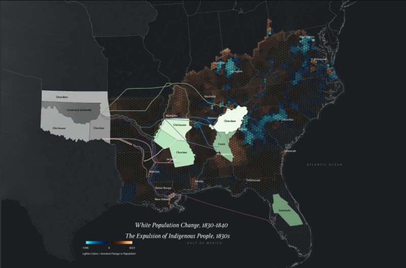
Now that you have taken time to explore the StoryMap and become familiar with the way a StoryMap visualizes data to share historical narratives, let’s explore the first peoples who populated the American south towards the end of the 18th century and beginning of the 19th century. Take a few minutes to explore these maps of the Indigenous peoples of the American South.
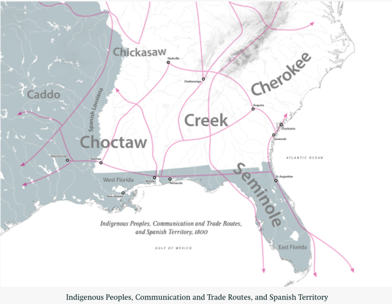
Compare this map to the animation of “The Cessation of Indigenous Lands” on the StoryMap. You will need to take time to watch the entire animation, noting how the map changes, to gain a better understanding of how the Native populations interacted with Spanish, Caribbean, and white European settlers at the turn of the century.
- How are symbols or colors used to indicate the movement of people, goods, and ideas?
- What patterns emerge as you view the animation?
- What does the term Cession mean, as included in the title of the map?
- How does the word Cession relate to the phrase, “generations of white incursions on their lands,” as included in the description of the map?
- What does this tell us about the relationship between Native Americans and other populations during this time?
Scroll down to the beginning of this animation on the StoryMap.
Next, take a few minutes to examine this population density map from 1830.
How does the overall population density of the United States compare to the areas inhabited by Native peoples?
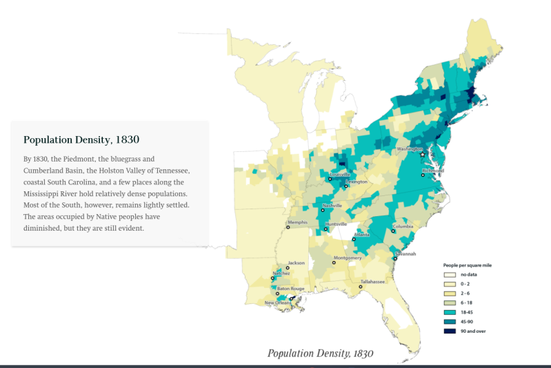
Compare the maps you previously viewed with this map (as viewed in the live StoryMap), paying careful attention to the lands inhabited by Indigenous peoples v. the white population.
Turn and talk to an elbow partner, or if working remotely, use the chat or a collaborative doc or tool such as a Google Slides to share your completed thoughts on the following statements about Indigenous populations in the late 18th and early 19th centuries.
Your teacher may ask you to complete this graphic organizer as an exit ticket.
Explain:
Where do we see patterns of migration of enslaved people across the South during the late 18th and early 19th centuries?
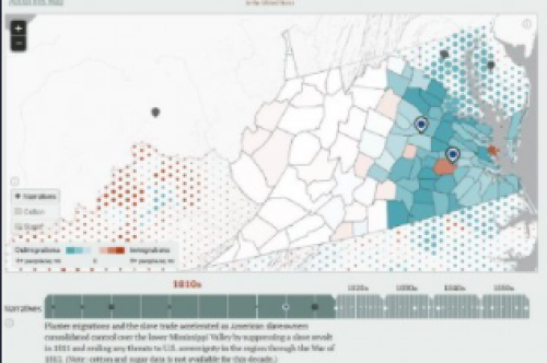
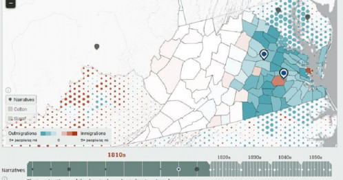
In addition to the original Native populations who inhabited the South, the largest group of people who were moving were those brought to the Americas in the early 17th century who did not come voluntarily. Take a few minutes to explore this map, as linked into the StoryMap, and examine The Forced Migration of Enslaved People.
The map includes detailed data on the relocation of approximately 850,000 enslaved men, women, and children, some moved as their owners settled into western territories formerly occupied by Indigenous peoples, and other bought and sold, forcibly uprooted from their homes, separated from their families as they were moved through the American slave trade and the migration of planters from 1810 to 1860.
This graphic helps interpret the map:
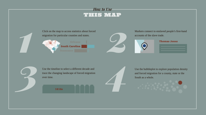
Use each of these 4 features to explore the map.
- In which decade did the data show the greatest out-migration of enslaved Africans?
- From which state did you notice the greatest outmigration?
- Select one or more of the narratives from one of the states with a large number of outmigrations. What do these narratives tell you about the migration patterns of enslaved Africans in the 1800s?
- As you study the timeline slider tool, what new information does this map share about the migration patterns of the Indigenous peoples as shared in the StoryMap, in comparison to the enslaved Africans?
- How does this new information change the way you previously studied or thought about the forced migrations of both groups?
Now return to the StoryMap, Southern Journey, “ONE: Creating the American South, 1790-1860.”
Take a few minutes to locate and analyze these graphs and maps and compare them to the information you learned from The Forced Migration of Enslaved People map. You will need to locate each as presented in the StoryMap, as they include detailed captions and some animations you will want to analyze.
Revisit the “I Used to Think… Now I Think …” graphic organizer. Complete a second copy, crafting all-new statements, including the information you have gained by exploring this second map of Forced Migration and comparing it to new information you learned using the StoryMap.

Your teacher may ask you to record your answers on the graphic organizer as an exit ticket, or if working remotely, share using a collaborative tool such as Google Slides.
Elaborate:
Which group of people hold the most power in terms of controlling land ownership and commerce during this time in comparison to others, and why?
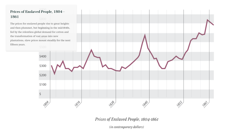
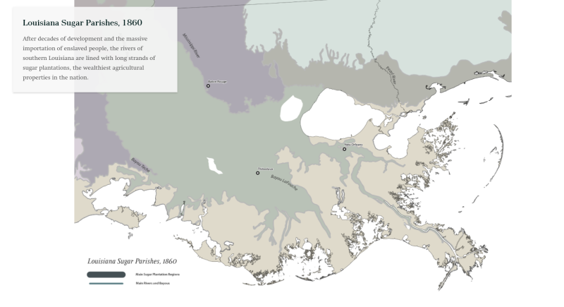
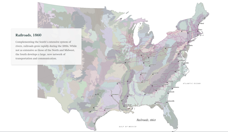
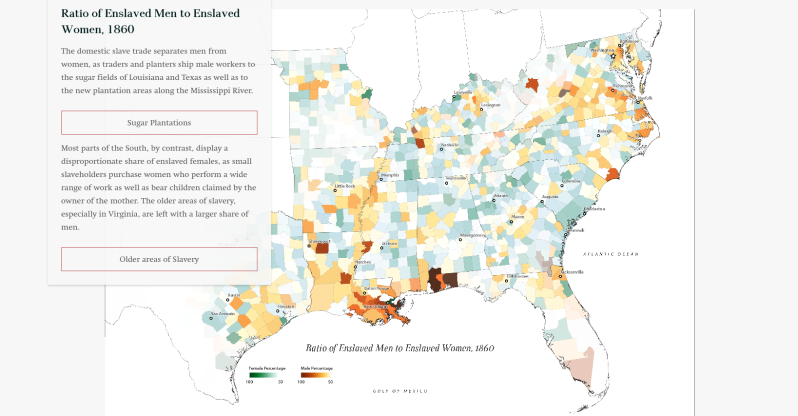
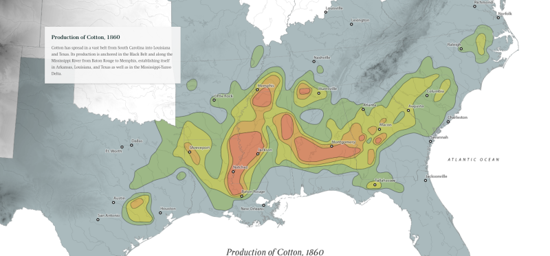
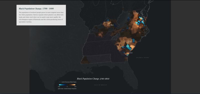
This StoryMap contains numerous maps comparing and contrasting the White population and Black population of the United States from 1790 to 1860. Some are presented as individual maps which may also be examined in closer detail as pop out maps, while others use a vertical time sliding tool for comparison. You will spend the majority of your time in this portion of the Learning Resources analyzing these maps, comparing and contrasting the patterns you see between both population subgroups. Remember to slow down and take your time as you scroll through each map. Take time to read the captions for each map. Pay close attention to the use of color on the maps. The maps show clear and striking patterns: shades of copper in the places where the number of people increased and those in blue where they declined. The brighter the colors, the greater the change. The captions describe the most important patterns in each map. (Note, the gallery images below only represent a portion of the maps you will need to view, be sure to locate and analyze all of the maps which appear with the black, copper and blue color scheme.)
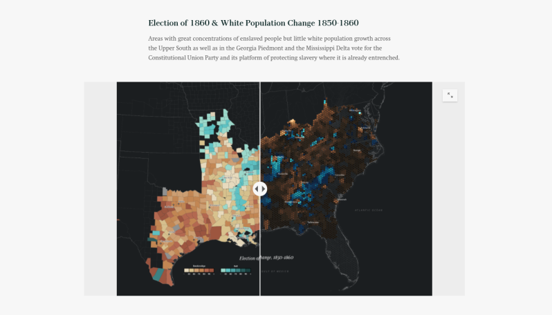
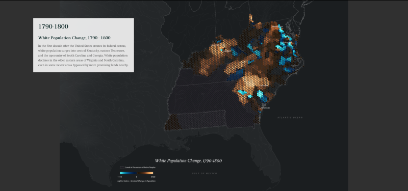
As you scroll though the StoryMap, analyzing the population patterns, think carefully about the previous maps you viewed about economic development, transportation and the buying and selling of enslaved people.
- How do the migration patterns on these maps relate to the shift from planters in the coastal areas to white and Black populations moving west?
- Where do you see new population growth?
- What might explain these shifts in terms of economic growth?
- How does the StoryMap or the narratives you read earlierin the Forced Migration map help tell the human side of this time period from the perspective of enslaved people?
To gain some perspective, we will revisit the earlier map we studied on forced migration by looking at some Bunk Connections.
Select an excerpt to view from those connected to the map. Use the right arrow underneath the stack of cards to select an excerpt you are interested in exploring. As you read, you will want to refer back to the map of Forced Migration of Enslaved People as linked into Bunk. Some of the excerpts you select may be a bit challenging for you to read. Don’t be afraid to push yourself — the Rewordify tool may be helpful as you follow along with the text.
Share the link to the connection between the map and the excerpt you selected using the Share Connection button below the images. Your teacher may have you share your connection via a collaborative doc such as Google Slides. Explain how the map and excerpt you shared relate to the migration maps you viewed in the Southern Journey Storymap.
Your teacher may ask you to share your Bunk Connection as an exit ticket.
Extend:
What predictions might you make for exploring Part TWO of the Southern Journey StoryMap, and what evidence might you cite to support your ideas?
If you and your classmates have been exploring the Southern Journey StoryMap using all 5 of the “Es” in this Learning Resource, or even if you only explored one or two, you are well on your way to understanding how StoryMaps help us visual data, compare and contrast patterns and look for evidence to support our understandings of the human stories behind maps, graphs and charts like to ones we often find in history textbooks or digital scholarship like the maps you have explored here. Maps can also help us synthesize information, and make historical predictions.
Read this quote from Southern Journey: The Migrations of the American South, 1790–2020, the book upon which the StoryMap is based.
“Migration created the anomalies that defined the slave South. Slavery concentrated on the richest land and yet spread everywhere in the region. Most white southerners did not own enslaved people, yet the institution went everywhere white settlers went. It benefited nonslaveholders little, and yet the migration of nonslaveholders allowed the slave South to expand as fast as the North. The place of slavery in the territories held little practical consequence for the white majority of southerners, and yet they went to war to defend that expansion. Only migration can explain these puzzles.”
Use the graphic organizer provided by your teacher to help you analyze the quote and make predictions about what you might see or learn about in the second and third parts of the StoryMap, or by reading the book.
We would love to hear about your predictions or thoughts on the Southern Journey StoryMap or book. Feel free to share them with us via social media (links on our pages) if your teacher or grownups allow, or have them email us at editor@newamericanhistory.org!
Check your school or local library and request a copy of Southern Journey: The Migrations of the American South, 1790-2020. We “Mapsolutely” recommend it!
Your teacher may ask you to share your graphic organizer as an exit ticket.
Citations:
Ayers, Edward L., Justin Madron, and Nathaniel Ayers. “Creating the American South, 1790-1860.” ArcGIS StoryMaps. American Panorama/Digital Scholarship Lab, University of Richmond via Esri, November 9, 2020. https://storymaps.arcgis.com/stories/34e0e42dc461499f85b369b43f9e44f6.
Ayers, Edward L., Justin Madron, and Nathaniel Ayers. Southern Journey the Migrations of the American South, 1790-2020. Baton Rouge: Louisiana State University Press, 2020.
Ayers, Edward L., Justin Madron, Robert K. Nelson, and Nathaniel Ayers. American Panorama - Forced migration in the American south. Digital Scholarship Lab, University of Richmond, November 9, 2020. https://dsl.richmond.edu/panorama/forcedmigration/.
View this Learning Resource as a Google Doc