This work by New American History is licensed under a Attribution-NonCommercial-ShareAlike 4.0 (CC BY-NC-SA 4.0) International License. Permissions beyond the scope of this license may be available at newamericanhistory.org.
Using Data to Explore History
View Student Version
Standards
National Council for Social Studies:Theme: Power, Authority, and GovernanceTheme: Civic Ideals and Practice
EAD RoadmapCSGQ7.3C: How does digital information, including social media, help us to get information, but make it hard to get reliable information?
Teacher Tip: Think about what students should be able to KNOW, UNDERSTAND and DO at the conclusion of this learning experience. A brief exit pass or other formative assessment may be used to assess student understandings. Setting specific learning targets for the appropriate grade level and content area will increase student success.
Suggested Grade Levels: High School (9-12)
Suggested Timeframe: Two 90-minute sessions.
Suggested Materials: Internet access via laptop, tablet or mobile device
Key Vocabulary
Aesthetics - a particular theory or conception of beauty or art; a particular taste for or approach to what is pleasing to the senses and especially sight.
Cartographer - A mapmaker.
Demographic data - Statistical information about a group of people (e.g., gender, race, ethnicity, age, or income).
Decennial - recurring every ten years.
Headline - a heading at the top of an article or page in a newspaper, magazine, or online source.
Infographic - A visual image such as a chart or diagram used to represent information or data.
Interdisciplinary - the combination of multiple academic disciplines into one activity. It usually draws knowledge from several fields such as geology, history, economics, etc.
Home Owners’ Loan Corporation (Redlining) Maps - Maps created by the Federal Home Owners’ Loan Corporation in the early 20th century to classify loan eligibility based on the racial makeup of neighborhoods, often used to racially segregate populations. Later referenced as “redlining.”
Quantitative data - Information which is numerical or statistical (e.g., height, weight, temperature).
Qualitative data - Information which is narrative or which describes the quality of a thing (e.g., open-ended survey responses, a photograph).
Redlining - Redlining is a discriminatory practice in which financial services are withheld from neighborhoods that have significant numbers of racial and ethnic minorities. Redlining has been most prominent in the United States, and has mostly been directed against African-Americans. The term has come to mean racial discrimination of any kind in housing.
Survey - (noun) is a method of gathering information using relevant questions from a sample of people with the aim of understanding populations as a whole, or a physical survey of land using engineering equipment.
Survey - (verb) examine and record the area and features of an area of land so as to construct a map, plan, or description. Alternatively it can be a means of investigation such as a questionnaire, either written or online.
U.S. Census - A country-wide survey that collects demographic data on the U.S. population, conducted every 10 years.
Read for Understanding
Teacher Tips:
New American History Learning Resources may be adapted to a variety of educational settings, including remote learning environments, face-to-face instruction, and blended learning.
If you are teaching remotely, consider using videoconferencing to provide opportunities for students to work in partners or small groups. Digital tools such as Google Docs and Google Slides may also be used for collaboration. Rewordify helps make a complex text more accessible for those reading at a lower Lexile level while still providing a greater depth of knowledge.
The Headlines strategy, adapted from Facing History, is used in the “Engage” section of this Learning Resource to help students process their thinking after viewing an image or reading one or more pieces of complex text. This Learning Resource also uses Turn and Talk to allow students to work with an “elbow partner” for brief collaborations.
In the “Explore” section of this Learning Resource, students will learn about W.E.B. Du Bois’s infographics. For more information on this topic, see our other Learning Resource, W.E.B. Du Bois: The 1900 Paris Exposition and the Case For Negro Citizenship. The Library of Congress’s Primary Source Analysis Tool, structured around “Observe,” “Reflect,” and “Question,” is also used to help structure student thinking.
The “Explain” section uses Mapping Inequality, a digital map exploring unjust federal housing policies from the New Deal era, and an image of an engraving of a slave ship from 1788. Exercise caution when using sensitive historical content in your classroom. (See helper text below.)
This Learning Resource uses New American History’s Reflective Journal tool in the “Extend” section. The U.S. Census Bureau’s data visualization tools are also used to explore how data may be analyzed with students.
This learning resource contains sensitive historical images, facts and terms, such as a discussion of slave transport ships and the use of the term “negro”. Some students may be triggered emotionally by the content; when available follow your district’s Social Emotional Learning (SEL) guidelines. Also, be aware of a student’s ability to process the information independently. This link from SAVVAS offers ideas for providing SEL support ideas and examples to assist with instruction. Throughout the lesson, teach with resilience, incorporate self-awareness, connect relationships to today, and consider accountability.
These Learning Resources follow a variation of the 5Es instructional model, and each section may be taught as a separate learning experience, or as part of a sequence of learning experiences. We provide each of our Learning Resources in multiple formats, including web-based and as an editable Google Doc for educators to teach and adapt selected learning experiences as they best suit the needs of your students and local curriculum. You may also wish to embed or remix them into a playlist for students working remotely or independently.
Read for Understanding (for students)
In this lesson, you will explore the role of data analysis and visualization across many forms. You will learn about how data is used to highlight contemporary problems, such as homelessness or income inequality, and how data has been used in the past with outcomes that may or may not benefit all citizens. You will learn to think critically about how information is presented by analyzing maps, infographics, and charts, and about how data collection practices can result in flawed information. Finally, you will bring all of this together to create your own map with U.S. Census Data.
Engage:
What is data science? Why is it important to include data science as you learn about both the present and the past?
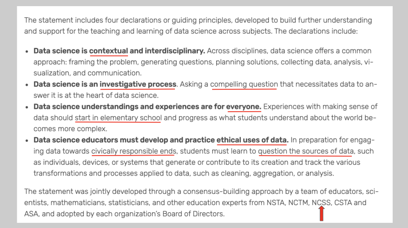
In May of 2024, five major education organizations released this message: Data Science: A Joint Position of NCTM, NSTA, ASA, NCSS, and CSTA. Their statement will give you a basic overview of what data science is and why you should study it as part of your history education courses.
Data scientist Jeremy Ney’s Why I use data to evaluate inequality is a personal reflection on why he began visualizing data for a more public audience. Read the blog, then explore more about Ney’s work on his website or his Substack channel, American Inequality. New American History’s Office Hours session with Ney on “Data Literacy and Visualization” can be found here, and the accompanying slides can be found here.)
Turn and Talk with a partner:
- How does Ney use data to investigate inequality? What kinds of data does Ney use, and how does he present this data to the reader in different ways?
- Explain what Ney means by “Opportunity Mapping.”
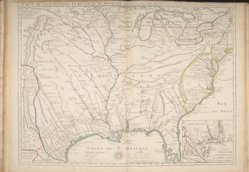
Professor Susan Schulten’s How Maps Reveal, and Conceal, History includes additional insights into how maps may be used to visualize data, and how we must look closely to interpret the data.
Turn and Talk with a partner:
- What does Schulten mean when she writes that “old maps are valuable as both records and agents of history”? Can you think of any maps you’ve seen that capture this idea?
- Where do you encounter data in your everyday lives? How do you use—or not use—it?
Working with your partner, create a headline for an article you might submit to your school newspaper that captures the most important aspect that should be remembered. Your headline may not be the same as any of the sources you reviewed from Jeremy Ney or Susan Schulten.
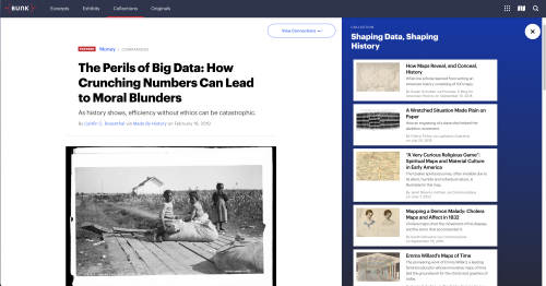
Headlines should contain both subjects and verbs and are usually no more than 12 words in length. Include a brief statement (1-3 sentences) about how you decided what words/themes to include in your headline, and cite three pieces of evidence you used from the resources you explored that support or explain your headline. Examples of related headlines can be found here, on a Bunk “Collections” page, though you will be creating new and unique headlines.
Your teacher may ask you to record your answers on an exit ticket.
Explore:
How is data presented? How can it be used to make an argument?
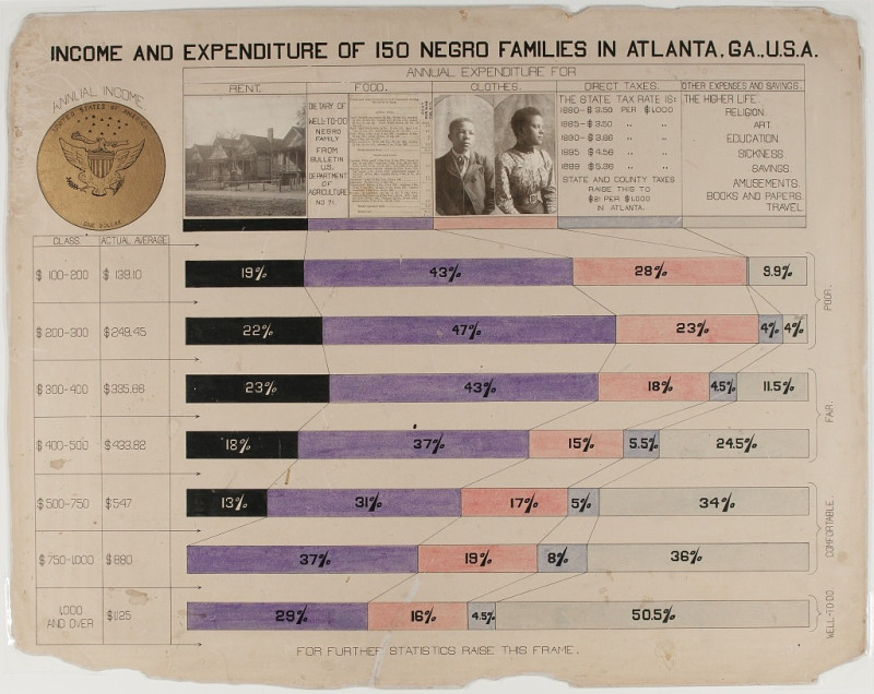
Your teacher will display a W.E.B. Du Bois chart of “Income and Expenditure of 150 Negro Families in Atlanta, G.A., USA” on the board.
Discuss as a class:
- What do you notice about the chart? How is it structured? Where does the data come from?
- What kind of argument do you think the chart is making? What is Du Bois trying to show, and why did he make the graphic choices he did?
- What remaining questions do you have?
Then, read a short summary about W. E. B. Du Bois’s Hand-Drawn Infographics of African-American Life (1900). Scroll to the bottom of the page and pick another one of Du Bois’s infographics.
Consider the questions you discussed as a class, and use the Library of Congress’s Primary Source Analysis Tool to record your observations, reflections, and questions. Your teacher may provide a paper copy of this graphic organizer, or if working digitally, you may use this fillable .pdf link. Be sure to print or save the document as a .pdf file to capture and save your responses.
In groups of three, share observations about the infographic you chose. Compare the infographic you chose with the ones your peers chose.
Discuss as a group:
- How is data represented in each infographic? Think about shapes, colors, layout, text, etc. What similarities and differences do you notice between the infographics? Why might Du Bois have made those choices?
- How do the infographics balance aesthetics with clarity? Are there moments when clarity is sacrificed for aesthetics? Are there moments when aesthetics are sacrificed for clarity?
- Altogether, what is Du Bois trying to do with his infographics?
Your teacher may ask you to record your answers on an exit ticket.
Explain:
How is data used? What does it ‘do’?
Read an excerpt from Caitlin C. Rosenthal’s The Perils of Big Data: How Crunching Numbers Can Lead to Moral Blunders. (Full link in Bunk at end of excerpt.)
Your teacher will then split you into two groups.
Group 1:
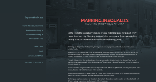
Group 1 will investigate a series of New Deal-era maps. These were documents made by the Federal Home Owners’ Loan Corporation (HOLC) in the early 20th century that classified loan eligibility based on the racial makeup of neighborhoods. In more recent years they’ve come to be known as “redlining” maps.
First, take a few minutes to explore the maps via Mapping Inequality, from the Digital Scholarship Lab at the University of Richmond.. Pick a place that interests you—maybe your hometown, or a place you’ve visited—and see what you can learn through observation. Discuss your observations with your group.
Then, read the Introduction of Mapping Inequality: Redlining in New Deal America to learn more about the history of redlining. After finishing, go back to the maps and explore again. As you explore, think about the role of data, and data visualization, in the process of segregating American cities.
Discuss with your group:
- How do redlining maps visualize demographic data? What categories are used? How does something as simple as color make an implicit argument about race?
- How did federal, state, and local government agencies use redlining maps to racially segregate populations?
- Discuss how these redlining maps are, as Susan Schulten writes, “both records and agents of history.”
Group 2
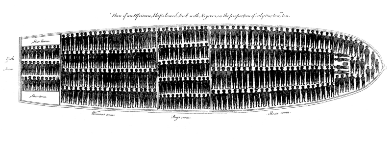
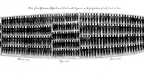
Group 2 will consider the 1788 graphic Plan of an African Ship’s Lower Deck with Negroes in the Proportion of Only One to a Ton. This image, as Cheryl Finley writes, was “the first abolitionist engraving of a slave ship.”
First, take a few minutes to carefully explore the graphic, and consider the following among your group:
- How does it communicate information?
- Can it be described as a graph or a chart?
- Is it something else?
Then, read Finley’s short article in Lapham’s Quarterly about the history of the graphic.
Discuss with your group:
- What did the formerly enslaved abolitionist Olaudah Equiano see in the graphic? Why, according to him, was it such a powerful representation?
- How did the Society for Effecting the Abolition of the Slave Trade, the creator of the graphic, use both visual and textual information to make an argument about slavery? What argument were they making?
- How does the graphic communicate the conditions of the slave trade? How does it make you think about the line between art and quantitative data? Discuss the relationship between the affective and informational elements of the graphic.
Then explore connected content via Bunk.
Both Groups
After both groups have concluded their discussions, the whole class will come back together. Each group will project their map onto the board and share what they learned.
Your teacher will lead a whole class discussion to help you consider the following questions:
- What are the similarities and differences between the redlining maps and the slave ship graphic? What are the differences?
- How was data used to make an argument in each? What does the data highlight and what does the data obscure, or leave out?
- Do you think data can be inherently ‘good’ or ‘bad’?
Your teacher may ask you to record your answers on an exit ticket.
Elaborate:
Where does data come from?
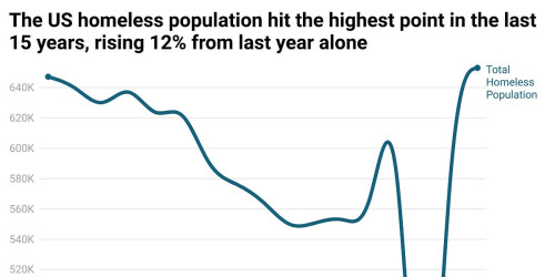
Read Jeremy Ney’s Why homelessness just hit a 15-year high, rising 12% from last year.
Discuss with a partner:
- How does Ney use data to make his argument?
- What methods of visualization does he use? From what data sources does Ney draw his information?
Then read his piece My hands-on experience gathering homelessness data in NYC.
Discuss with a partner:
- How is data collected in ‘the count’? How are surveying methods designed to protect against bias? How does the process fail?
- How did this second article change your opinion of the first one?
- How does it make you think about the objective—or subjective—nature of data?
Your teacher may ask you to record your answers on an exit ticket.
Extend:
Tell a story with data.
After reading about both the historic and contemporary role of data and data visualization, you will make a visualization of your own. To do this, you will use data from the U.S. Census Bureau available on data.census.gov.
Before you begin, watch this short video about the history of the U.S. Census. Then, follow these instructions in the tutorial video on how to make a map using census data. We suggest you work with a partner, with one person displaying these directions on their screen, and the other person building the map.
Here are some instructions on how to make your map:
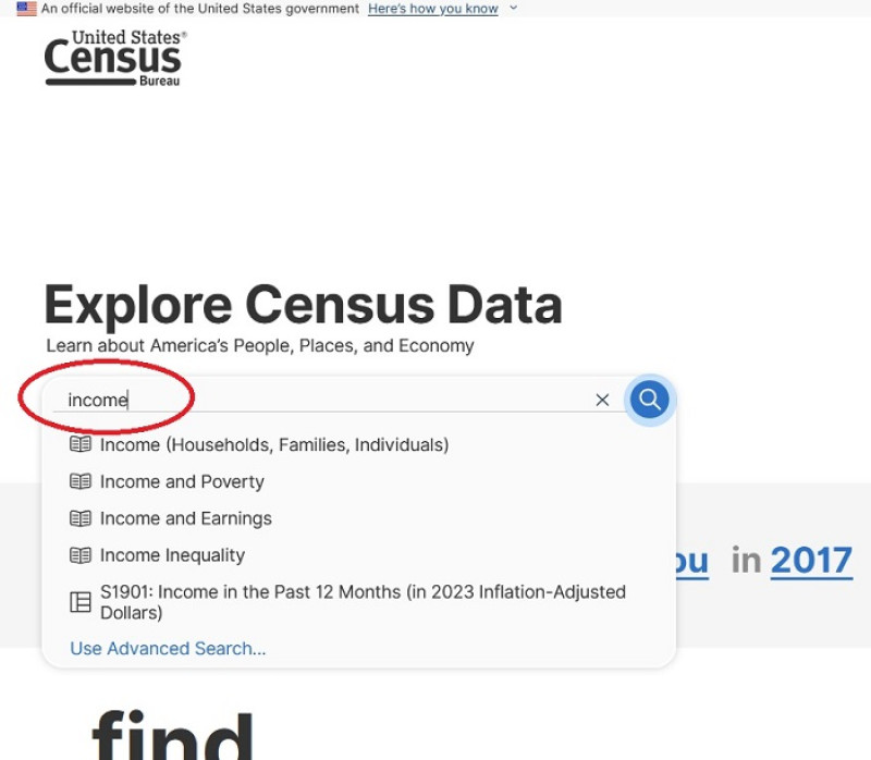
First, type in a data topic relevant to the U.S. Census into the search bar. (We used Income for this example.) Then click the blue magnifying glass icon to search.
Select a dataset that you are personally interested in. Do you care about transportation? Or food access?
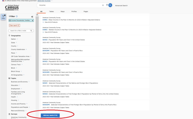
On the results page, scroll down to the bottom and click “VIEW ALL MAPS.”
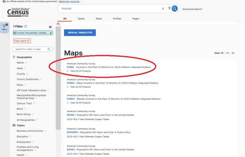
Then, select your specific dataset. (Note: The American Community Survey is a yearly survey conducted by the Census Bureau to supplement census data. To read more about the differences between the ACS and the Census, click here.)
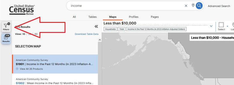
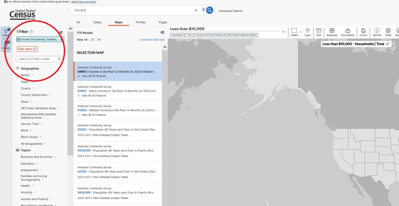
After you select your dataset, click the “Filters” button in the top left if filters are not showing as in the screenshots below.
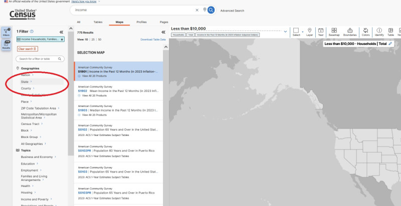
Choose what geography you will filter your data by. This example will be filtered by states. (If you get "no results" wait for the list to populate, it can be slow.)
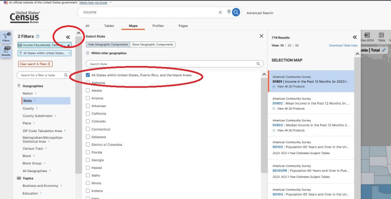
Click “State” and then select “All states within United States, Puerto Rico, and the Island Areas.” Then use the two arrows to collapse the menu.
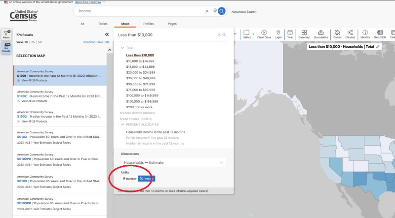
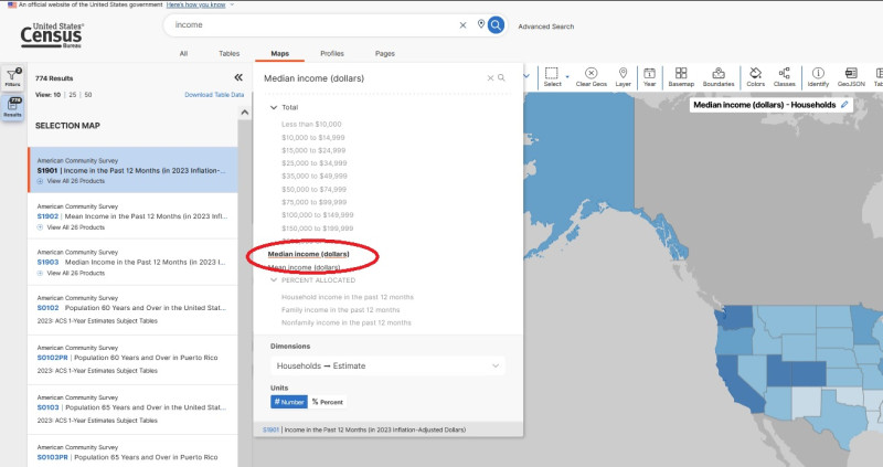
Now, the map shows the percentage of households in each state that make less than $10,000 per year. To change what data the map displays, click “Less than $10,000” in the upper left, choose “# Number” for the units at the bottom of the dropdown, and then select “Median income (dollars).”
Now, the map shows the median income of each state.
This is a perfectly good map, but to learn about other aspects of the dataset, click the “More Tools” button on the right side of the page and then select “Table” and then “View Full Table.” Take a minute to browse through the data, familiarizing yourself with the various categories and how it is structured. Then go back to the map view and use the other buttons on the top of the page, such as “Year,” “Basemap,” Boundaries,” “Colors,” and “Classes” to change how your map appears.
As you make your map, think about what kind of data and results are you most interested in learning about. Maybe healthcare and the disparities that might exist, for example? You might highlight where people don’t receive adequate healthcare vs where healthcare is successful. This might help you to show disparities in healthcare access between populations.
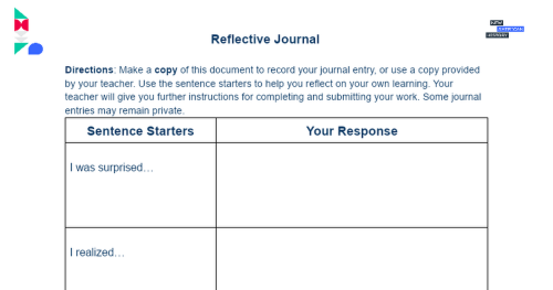
Think about Schulten’s idea of a map as both “records and agents of history.” After finishing your map, complete a reflective journal.
Think about how your map might be read today and as an artifact many years in the future. What might historians learn about our society when looking at your map?
Your teacher may ask you to record your answers on an exit ticket.
Citations:
“Create a Headline.” Facing History & Ourselves, October 4, 2018. https://www.facinghistory.org/resource-library/create-headlineFinley, Cheryl. “A Wretched Situation Made Plain on Paper.” Lapham’s Quarterly, July 25, 2018. https://www.laphamsquarterly.org/roundtable/wretched-situation-made-plain-paper.
Green, Adam. “W. E. B. Du Bois’ Hand-Drawn Infographics of African-American Life (1900).” The Public Domain Review, February 7, 2017.. https://publicdomainreview.org/collection/w-e-b-du-bois-hand-drawn-infographics-of-african-american-life-1900/.
“How to Create a Map from Scratch Using Data.Census.Gov.” Accessed August 6, 2024. https://www.census.gov/library/video/2022/how-to-create-a-map-from-scratch-using-data-census-gov.html.
National Council of Teachers of Mathematics, National Science Teaching Association, American Statistical Association, National Council for the Social Studies, and Computer Science Teachers Association. “Data Science: A Joint Position of NCTM, NSTA, ASA, NCSS, and CSTA,” April 2024. https://www.nctm.org/Standards-and-Positions/Position-Statements/Data-Science/.
Nelson, Robert K., LaDale Winling, Richard Marciano, and Nathan Connolly. “Mapping Inequality.” American Panorama, ed. Robert K. Nelson and Edward L. Ayers. Accessed August 6, 2024. https://dsl.richmond.edu/panorama/redlining/.
Ney, Jeremy. “My Hands-on Experience Gathering Homelessness Data in NYC.” Substack newsletter. American Inequality (blog), February 21, 2024. https://americaninequality.substack.com/p/homeless-count.
Rosenthal, Caitlin. “The Perils of Big Data: How Crunching Numbers Can Lead to Moral Blunders.” Washington Post, February 18, 2019. https://www.washingtonpost.com/outlook/2019/02/18/perils-big-data-how-crunching-numbers-can-lead-moral-blunders/.
Schulten, Susan. “How Maps Reveal, and Conceal, History,” Process: A Blog for American History, September 13, 2018. https://www.processhistory.org/schulten-maps/.
United States Census Bureau. “Explore Census Data.” Accessed August 6, 2024. https://data.census.gov/.
Untold History. “How The Census Changed America,” September 22, 2020. https://www.youtube.com/watch?v=a-uiW9B4gKU.
“Why Homelessness Just Hit a 15-Year High, Rising 12% from Last Year.” Substack newsletter. American Inequality (blog), January 10, 2024. https://americaninequality.substack.com/p/homelessness-and-inequality-2024.
“Why I Use Data to Evaluate Inequality.” Substack newsletter. American Inequality (blog), September 13, 2023. https://americaninequality.substack.com/p/why-i-use-data.
View this Learning Resource as a Google Doc


